Two axis with TGraph

Hi,

I am trying to display a plot with two different axis which should be “attached” to the same datapoints.

I have tried to follow the tips here: http://root.cern.ch/root/html/tutorials/hist/transpad.C.html

but am not exactly getting the result I would like.

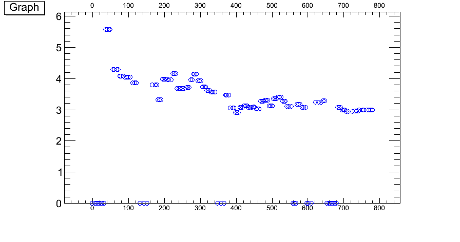
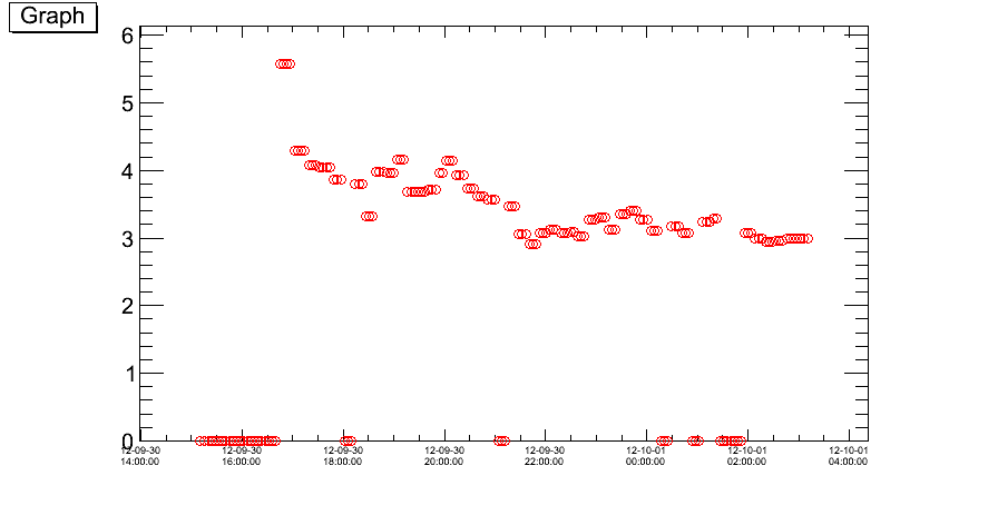
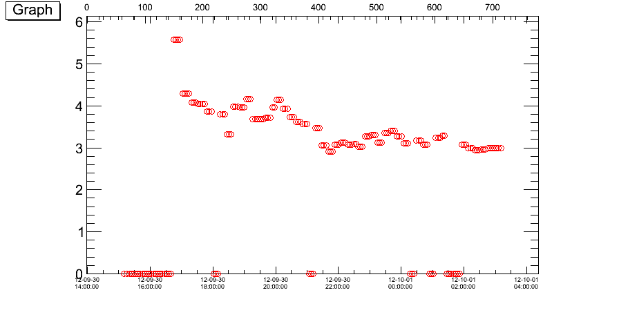
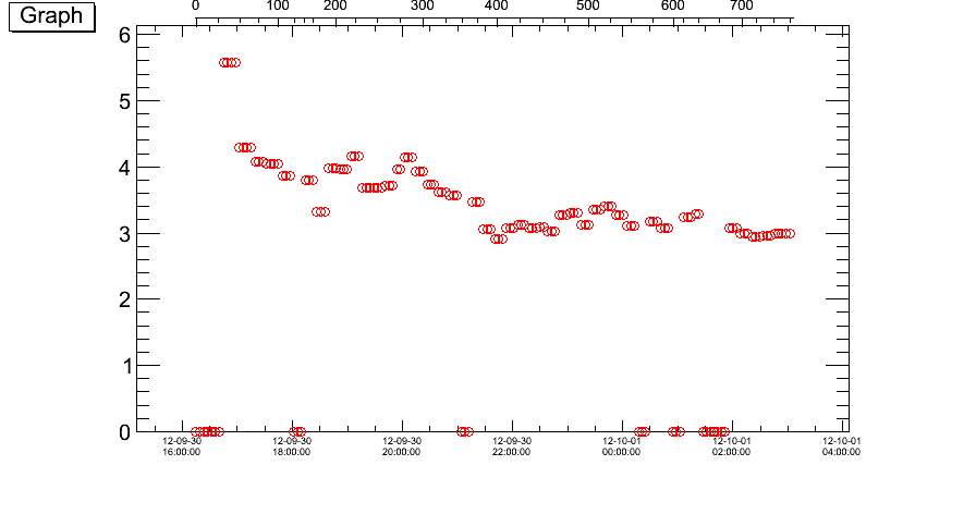
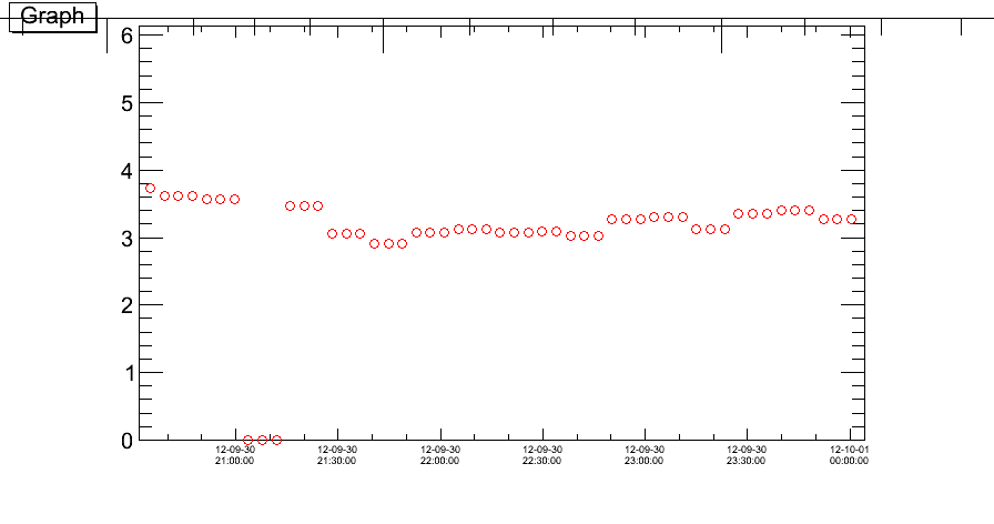
The point is: I have a graph, and I want to display the x-axis in two different formats, in my case, one with time, and the other with lumiblocks.

I tried the approach to make two versions of the same graph, and draw them on top of each other, with the second pad invisible. However, the second pad anyway seems to cover the first, and only the second graph drawn is shown (but both axis are as I want visible.)

I attach a small macro which shows the two graphs (which have identical y-values, but different x-values connected to them), drawn separately, and then tried to drawn together, but with the wrong result (only blue markers are shown, and not the red which are hidden beneath pad2).

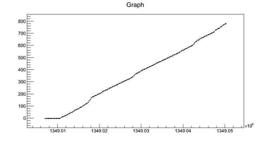
Another difficulty is: I want to make sure that the two graphs really are drawn exactly on top of each other, that means that the x-values need to be spaced in the same way. Is there something I have to take especial care of then?

Thanks a lot,
Maiken
axisTest.py (6.08 KB)

Try TGaxis as in, for example, gaxis.C and/or manyaxis.C
Or try twoscales.C

Thank you,

however, how do I make sure that the axis actually follows my datapoints? Especially if the datapoints are not evenly spaced?

Maiken

You can draw your graph, then retrieve its x-axis “properties” (i.e. x-min and x-max), and then create a TGaxis using appropriate values (“calculated” from these “properties”).
Note that, you can also easily create a TGaxis which uses a TF1 (i.e. any function) to map axis values: http://root.cern.ch/root/html/TGaxis.html#TGaxis:TGaxis@3

Thank you again.

Sorry for not being able to grasp all the details, but can I create a function from my x and y-arrays that I have already created, and feed this into the TGaxis? I can’t seem to see a constructor for a function which receives an x and y-array?

Thanks,
Maiken

Hi again,

so, I seem to be a bit closer to the solution, but now quite there yet. Attached a new version of the macro. From line 86 now…

As I said, I want to draw a graph that has the x-axis versus time on the bottom, and versus lb on the top, but both x-axis are connected to the same y-values of the graph.

If I comment out line 86 and comment in line 91 I get the result as attached and called “DrawLB.png”. You see two axis, as I want, and the two axis seem to be properly aligned.

However, I want to draw the graph with the time on the bottom axis, so commenting in line 86 and out line 91, I get the result as attached “DrawTime.png”. You see now that I do not successfully get the upper axis.

I quote the relevant part of the macro here:

c3 = TCanvas("c3","",900,500)
c3.cd()


#plots['Time'].Draw("ap")

# ##comment in and comment out above to see the two axis displayed
# ##however, I want the time on the bottom x-axis and lb on the top x-axis..
# ##so I want the 'Time' plot to be drawn, and not the 'LB' plot.. why does that not work?
plots['LB'].Draw("ap")
c3.Update()


axis1 = plots['LB'].GetXaxis()
xmin = axis1.GetXmin()
xmax = axis1.GetXmax()
ypos = c3.GetFrame().GetY2()


print 'xmin=',xmin, 'xmax=',xmax, 'ypos=',ypos
x_axis2 = TGaxis(xmin,ypos,xmax,ypos,xmin,xmax,510,"-")
x_axis2.SetName("x_axis2");
x_axis2.SetLabelFont(42)
x_axis2.SetLabelSize(0.03)
x_axis2.Draw()
x_axis2.Print()

c3.Update()

What am I doing wrong I wonder?

Thanks a lot!
Maiken


axisTest.py (6.74 KB)

Hi again,

sorry for the many posts. I got the xaxis drawn on the top margin now, I had just gotten hold of the wrong axis.

However, the alignment to the points is not correct, and is what I have been struggling with all the time.

This is why I first thought to make two of the same graphs and plot them together.

New version of the macro attached, and also a figure showing the result.

Maiken


axisTest.py (6.66 KB)

Looking at:

c4 = TCanvas("c4","",900,500)
c4.cd()

plots['AXES'] = TGraph(Nbins-1, m_time, m_lb)
plots['AXES'].Draw("ap")

c4.Update()

one can see that it’s not just a simple “linear scaling factor” which is needed. I think you would need to create a TF1 object out of the “AXES” TGraph (don’t forget to TGraph::Sort it first), with use of the TGraph:Eval method (though I have some concerns about the first 16 points for which m_lb = -1), and then pass this function to the TGaxis(Double_t xmin, Double_t ymin, Double_t xmax, Double_t ymax, const char* funcname, Int_t ndiv = 510, Option_t* chopt = “”, Double_t gridlength = 0) constructor.


Thanks a lot for the suggestion.

How exactly do you propose to use Eval to make a function? Do you mean to use Eval to extract the y-values of the plots[‘AXES’]? But these values I have at hand anyway, so then why use Eval? Maybe you suggest the use of Eval since there is some handy connection with TF1?

How will it help to map the bottom time-x-values with the lb-x-values? I guess I don’t really understand how the function is used in the TGaxis.

What I really would want, is to just be able to match each y-value with two different x-values, and plot these two different x-axis. But there is probably no exact straight-forward way of doing this…?

Thanks!
Maiken

Hi again,

thank you very much for your suggestions. I think I got it now.

Attached the working macro. I had to interchange the x-and y-axis on the plots[‘AXES’], but I believe now that it is correct.

I also paste here the main part of the code for other peoples interest:

# ##Create a graph with the time and lb-axis - to be able to map the two values
c4 = TCanvas("c4","",900,500)
c4.cd()
plots['AXES'] = TGraph(Nbins-1, a_lb, a_time)
plots['AXES'].Draw("ap")
plots['AXES'].SetMarkerStyle(7)
c4.Update()

# ### Main part, draw the graph with time-values on bottom x-axis and lb-values on top x-axis
def myfunc(x):
    """ this is how to extract the value of the buffer """
    time_val = plots['AXES'].Eval(x[0])
    return time_val

myfunc = TF1("myfunc",myfunc,min_lb,max_lb)

c3 = TCanvas("c3","",900,500)
c3.cd()
plots['Time'].Draw("ap")
c3.Update()

xmin = a_time[0]
xmax = a_time[Nbins-1]
ypos = c3.GetFrame().GetY2()


x_axis2 = TGaxis(xmin,ypos*1.02,xmax,ypos*1.02,"myfunc",510,"-")
x_axis2.SetName("x_axis2");
x_axis2.SetLabelFont(42)
x_axis2.SetLabelSize(0.03)
x_axis2.Draw("same")
x_axis2.Print()

Thanks a lot!
Maiken


axisTest.py (7.19 KB)

Hi again,

one last request: Is it possible to make the upper x-axis also follow when I use the zoom-function in the canvas? The top axis looks strange when this is done, see attachement.

Thanks,
Maiken


It looks like you should set xmin and xmin according to to pad coordinates.

Hi,

thanks for following up.

What do you mean by setting xmin and xmax, you mean setting the TGAxis min and max?

If so, this is what I do to get the result in the previous reply, doing something like this:

x_axis2 = TGaxis(xmin,ypos*1.02,xmax,ypos*1.02,"myfunc",510,"-")

where xmin and xmax are the timestamp positions, and myfunc transforms this to the other(lumiblock) axis that I want.

This worked, however, when zooming the plot, only the original x-axis is properly displayed, as you see in the snapshot.

Do you think it is still something to do with the xmin and xmax?

Thanks,
Maiken

Can you provide a .C (not .py) macro reproducing the problem ?

Hi,
well, I can attach the .C file that is produced using the .py macro, and you can try to zoom, and you will see the issue.

Maiken
g_RatioNoise_mean_B_0_wlumi.C (37.2 KB)

In your macro the TGaxis are drawn in absolute coordinates:

   TGaxis *gaxis = new TGaxis(1349005177.8,0,1349005177.8,9.342222999999999,0,6242.841000000001,510,"+L");
 ...
   gaxis = new TGaxis(1348950675,9.342222999999999,1349000473,9.342222999999999,3,979,510,"-");
...

When you zoom the Pad coordinate change … so your absolute value are wrong. I guess the way to follow the zooming would be to draw the axis in a TExec in which you inquire the actual Frame coordinates to adapt to them.

Hi,

so you mean to make the second x-axis a TExec type?

Is this what is the common thing to do if one uses two axis in the same graph?
Seems a bit overly complicated. I would have like the second axis to be connected to
the actual pad/canvas, but it does not seem to?

Thanks,
Maiken

the second axis to be connected to the actual pad/canvas

Yes the 2nd axis begin done that way you need to do the connection in some way. TGaxis is not “connected” to a pad. TExec is the way to do that connection.
There is alors the option X+ and Y+, or the option Ticks but I don’t thing they will help your case.