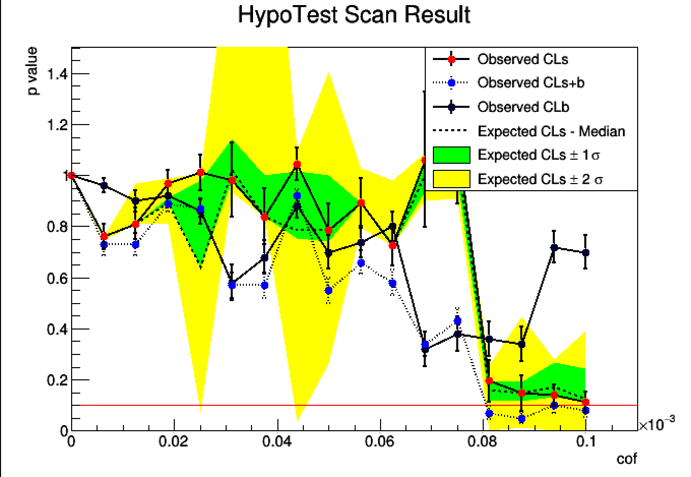
I’ve obtained a limit plot as attached.
In the plot, the X-axis is value to be scanned, Y is P-value.
The horizontal red line is 90% CL line.
From this plot, one can see, for cof > 5.2e^-5, both the “b only” and “s+b” are below 90% CL line.
My interpretation are following, please correct if I’m wrong.
1), the background model is not good, because it has been rejected(but currently, there is no better model).
2), the signal model should be rejected also, because the “s+b” is below 90% CL line.
Actually, I’m not pretty sure if my interpretation of 2) is correct.
The reason is if the “s+b” hypothesis has been dominated by the background model (naively, the amplitude of background is much bigger than signal ), this could be happen either.
My question is : do I need to worry about this possibility ?
Or I have missed something totally ?
The result you are getting seems a bit weird. Normally by increasing the parameter you are scanning you expect the background only model to not vary too much, since in principle it should be independent of the signal parameter you are scanning.
I would suspect there could be some error in the way the workspace model is defined.
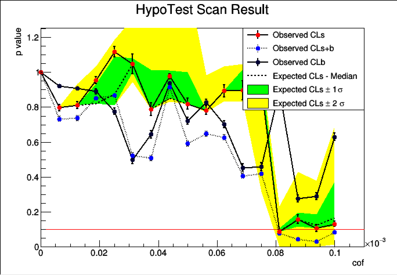
I have noticed a warning message at the beginning of analysis, which says,
[#1] INFO:InputArguments -- HypoTestInverter ---- Input models:
                 using as S+B (null) model     : ModelConfig
                 using as B (alternate) model  : ModelConfig_with_poi_0

[#0] WARNING:InputArguments -- HypoTestInverter - using a B model  with POI cof not equal to zero  user must check input model configurations
After checking my code carefully, I realized the range of the scanned POI might related.
The original form is like :
poi[5e-6, 1e-4];
After changing to
poi[0, 1e-4];
The plot looks much more meaningful, as shown in the following.
Still you have large oscillations between the different points. Have you tried to increase the number of toys ?
What is happening if you are using the asymptotic calculator ?
Also, you should check how do they look the test statistic distributions. It could be that several number of fit fail to converge to the right minimum
I have a comparison of two plots which only have the difference of toys, one is 100/50, another is 1000/500, everything else are exactly same.
It looks like for the big statistics plot, the oscillation has no improvement, thought the error bars are narrower.
Probably, I think that’s because my model is kind of complicated and have no way to be described in an analytic expression(I used a C++ script to describe my signal model). So RooFit can’t fit the signal model. As a result, the results of AC is messy.