Weird plots formatting

Howdy, I’m trying to do some weird formatting on my plots to recreate an axis shown here:

Ive made my own Tstyle to get the background and frame edges all gone (or just white in my case) and set fonts etc but I can either get rid of the line for the tgaxis and the ticks or neither. In the documentation ROOT: TGaxis Class Reference it states that

"To draw only the axis tick marks without the axis body, it is enough to specify the option "B" "

I’ve been trying to do this with the axis drawn as part of my TGraph but can’t seem to work out where to specify the option “B”. Could someone clarify?

To followup I also need to add the dollar sign before the numbers on the y axis. I can do this using a blank TH2 first, then the ‘unravel’ function and then setting bin labels, but this means the ticks are not next to the labels. Any way of setting alpha numeric labels on a TGraph axis such that the labels are next to the ticks?

{
   auto c = new TCanvas();
   c->SetFrameLineColor(0);
   auto frame = c->DrawFrame(1966.5, 290,1977.5,410);
   auto xaxis = frame->GetXaxis();
   auto yaxis = frame->GetYaxis();
   xaxis->SetLabelFont(132);
   yaxis->SetLabelFont(132);
   xaxis->SetNdivisions(11);
   yaxis->SetNdivisions(10);
   yaxis->ChangeLabel(1,-1,-1,-1,-1,-1,"$300");
   yaxis->ChangeLabel(2,-1,-1,-1,-1,-1,"$320");
   yaxis->ChangeLabel(3,-1,-1,-1,-1,-1,"$340");
   yaxis->ChangeLabel(4,-1,-1,-1,-1,-1,"$360");
   yaxis->ChangeLabel(5,-1,-1,-1,-1,-1,"$380");
   yaxis->ChangeLabel(6,-1,-1,-1,-1,-1,"$400");
   auto l = new TLine();
   l->SetLineColor(kWhite);
   l->DrawLine(1966.5, 290,1966.5,410);
   l->DrawLine(1966.5, 290,1977.5,290);
}

1 Like

Thanks Olivier that’s great. You even matched the font better than me. It seems the TGaxis comment proved to be a bit of a red herring.

I’m still having the issue however of plotting my TGraph over this as the TGraph axis overwrite the canvas draw frame.

import ROOT
from array import array

#define some data
x = list(range(1967, 1978))
y = [310, 330, 370, 385, 385, 393, 387, 380, 390, 400, 380]
n = len(x)

#make the canvas
c = ROOT.TCanvas()
c.SetFrameLineColor(0);
frame = c.DrawFrame(1966.5, 290,1977.5,410);

#set the axis style!
xaxis = frame.GetXaxis();
yaxis = frame.GetYaxis();

xaxis.SetLabelFont(132);
yaxis.SetLabelFont(132);
   
xaxis.SetNdivisions(11);
yaxis.SetNdivisions(10);
yaxis.ChangeLabel(1,-1,-1,-1,-1,-1,"$300");
yaxis.ChangeLabel(2,-1,-1,-1,-1,-1,"$320");
yaxis.ChangeLabel(3,-1,-1,-1,-1,-1,"$340");
yaxis.ChangeLabel(4,-1,-1,-1,-1,-1,"$360");
yaxis.ChangeLabel(5,-1,-1,-1,-1,-1,"$380");
yaxis.ChangeLabel(6,-1,-1,-1,-1,-1,"$400");

# Draw a white line over the axis bar
l = ROOT.TLine()
l.SetLineColor(ROOT.kWhite)
l.DrawLine(1966.5, 290,1966.5,410)
l.DrawLine(1966.5, 290,1977.5,290)


gr = ROOT.TGraph(n,array('d',x),array('d',y))
gr.SetMarkerStyle(20)
gr.Draw("APsame")

c.Draw()

gives just the regular TGraph canvas. Is there a Draw option or a RedrawAxis() that can help stop this overriding the current frame?

simply do:

gr.Draw("P")

no A. … no same

1 Like

amazing. Thanks again! and so fast!

1 Like

Ok just for fun, I can now share. I’ve been working on a data visualization course for a computer science department and the standard text is Edward Tufte’s book “the Visual Display of Quantitative Information” which for anyone dealing with data is an interesting and relaxed read.

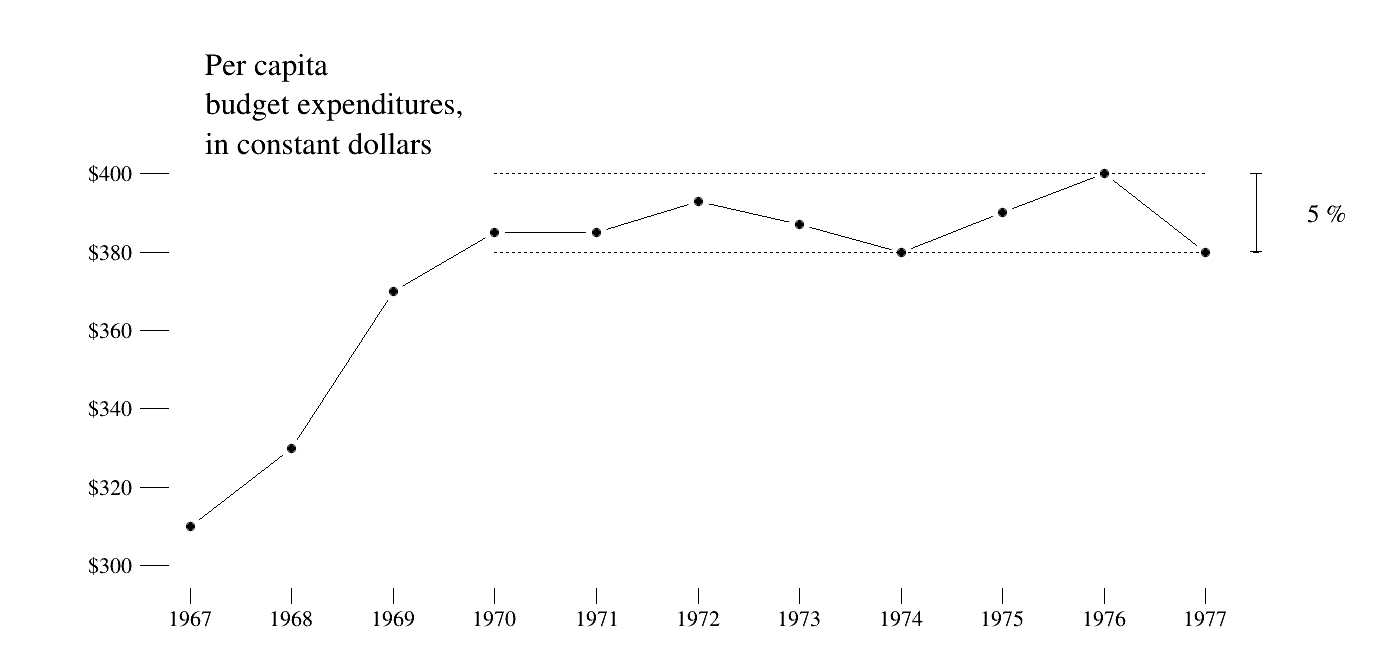
This excerpt is an implementation of one of the line plots found early on in the book (p68.) and seemed like a good challenge to implement in ROOT. So I wrote a quick tutorial to describe all the elements that this plot demonstrates. The full code now looks like this:

import ROOT
from array import array

#define some data
x = list(range(1967, 1978))
y = [310, 330, 370, 385, 385, 393, 387, 380, 390, 400, 380]
n = len(x)

#make the canvas
c = ROOT.TCanvas("c","c", 1400, 700)

pad = ROOT.TPad("p","p",0,0,1,1, 0)
pad.Draw()
pad.cd()
pad.SetFrameLineColor(0);
pad.SetTopMargin(.2)
frame = pad.DrawFrame(1966.5, 290,1977.5,410);

#set the axis style!
xaxis = frame.GetXaxis();
yaxis = frame.GetYaxis();

xaxis.SetLabelFont(132);
yaxis.SetLabelFont(132);

xaxis.SetNdivisions(11);
yaxis.SetNdivisions(10);
yaxis.ChangeLabel(1,-1,-1,-1,-1,-1,"$300");
yaxis.ChangeLabel(2,-1,-1,-1,-1,-1,"$320");
yaxis.ChangeLabel(3,-1,-1,-1,-1,-1,"$340");
yaxis.ChangeLabel(4,-1,-1,-1,-1,-1,"$360");
yaxis.ChangeLabel(5,-1,-1,-1,-1,-1,"$380");
yaxis.ChangeLabel(6,-1,-1,-1,-1,-1,"$400");

# Draw a white line over the axis bar
l = ROOT.TLine()
l.SetLineColor(ROOT.kWhite)
l.DrawLine(1966.5, 290,1966.5,410)
l.DrawLine(1966.5, 290,1977.5,290)

## Now add the data. 
# Making the graph first.
gr = ROOT.TGraph(n,array('d',x),array('d',y))
gr.SetMarkerStyle(20)

# adding the connecting line
gr_line = gr.Clone()
gr.Draw("L")

# adding white dots to highlight the data points
gr_white = gr.Clone()
gr_white.SetMarkerSize(2.5)
gr_white.SetMarkerColor(0)
gr_white.Draw("P")

# and the actual datapoints
gr.Draw("P")

## Now text and highlights
#dotted line first
l2 = ROOT.TLine()
l2.SetLineStyle(2)
l2.DrawLine(1970, 380, 1977, 380)
l2.DrawLine(1970, 400, 1977, 400)

#arrow between the 5% bars
ar = ROOT.TArrow(1977.5, 380 ,1977.5, 400, 0.01, "<|>")
ar.SetAngle(178)
ar.SetArrowSize(.0001)
ar.Draw()
five = ROOT.TText(1978, 387.5, "5 %")
five.SetTextFont(132)
five.SetTextSize(.04)
five.Draw()

#and the text
title_text = ROOT.TPaveText(1967, 430, 1970, 400)
title_text.SetTextAlign(11)
title_text.SetTextFont(132)
title_text.SetFillColor(0)
title_text.SetBorderSize(0)
title_text.AddText("Per capita")
title_text.AddText("budget expenditures,")
title_text.AddText("in constant dollars")
title_text.Draw()
c.Draw()
c.SaveAs("tufte_root.png")

1 Like

This topic was automatically closed 14 days after the last reply. New replies are no longer allowed.