Upper limits plots appear problematic

upperLimitPlots.zip (487.3 KB)
Hi Rooter,

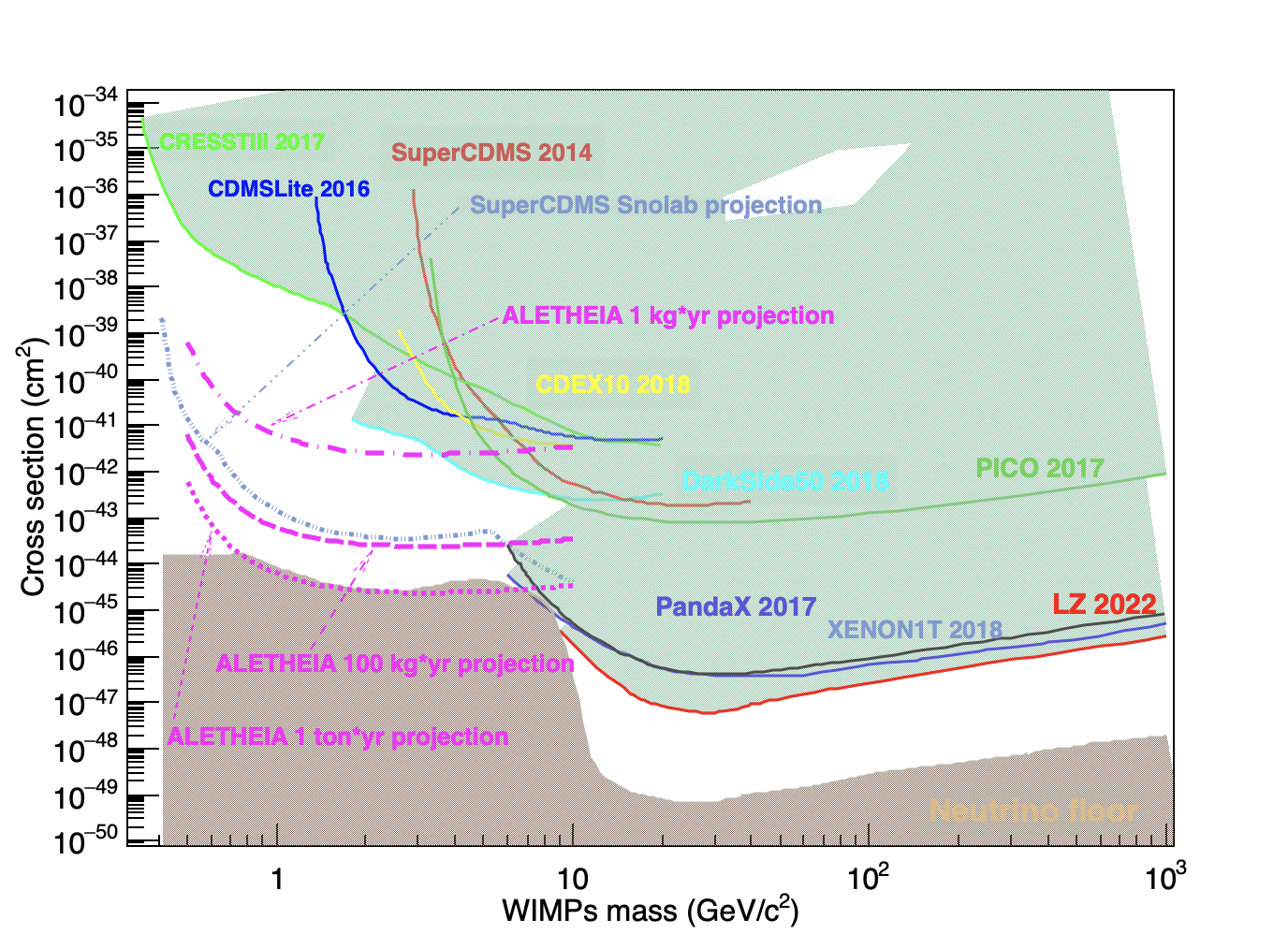
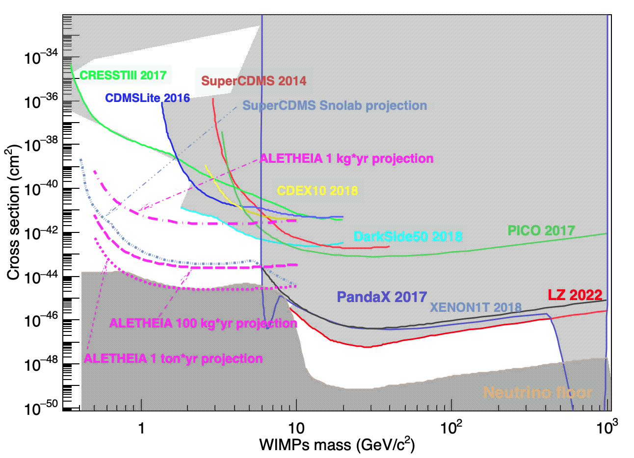
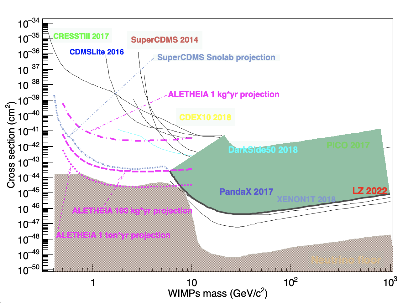
I am making an upper limit plot with the following scripts. However, the plot shows a problematic feature as the “problematicPlot” one attached. A normal one should be like the “normalPlot” one, also attached. The normal one was generated by running the script but by modification later.

All of the script file, text files, and plots are compressed into one file.

Could you please let me know how to make a plot?

Thanks.

Best,
Jun


Please read tips for efficient and successful posting and posting code

ROOT Version: 6.24.06
Platform: Mac OS 12.5.1
Compiler:
Configured with: --prefix=/Library/Developer/CommandLineTools/usr --with-gxx-include-dir=/Library/Developer/CommandLineTools/SDKs/MacOSX.sdk/usr/include/c++/4.2.1

Apple clang version 11.0.3 (clang-1103.0.32.62)

Target: x86_64-apple-darwin21.6.0

Thread model: posix


When I run your macro I get the following plot. What is problematic in this plot ?

Hi,
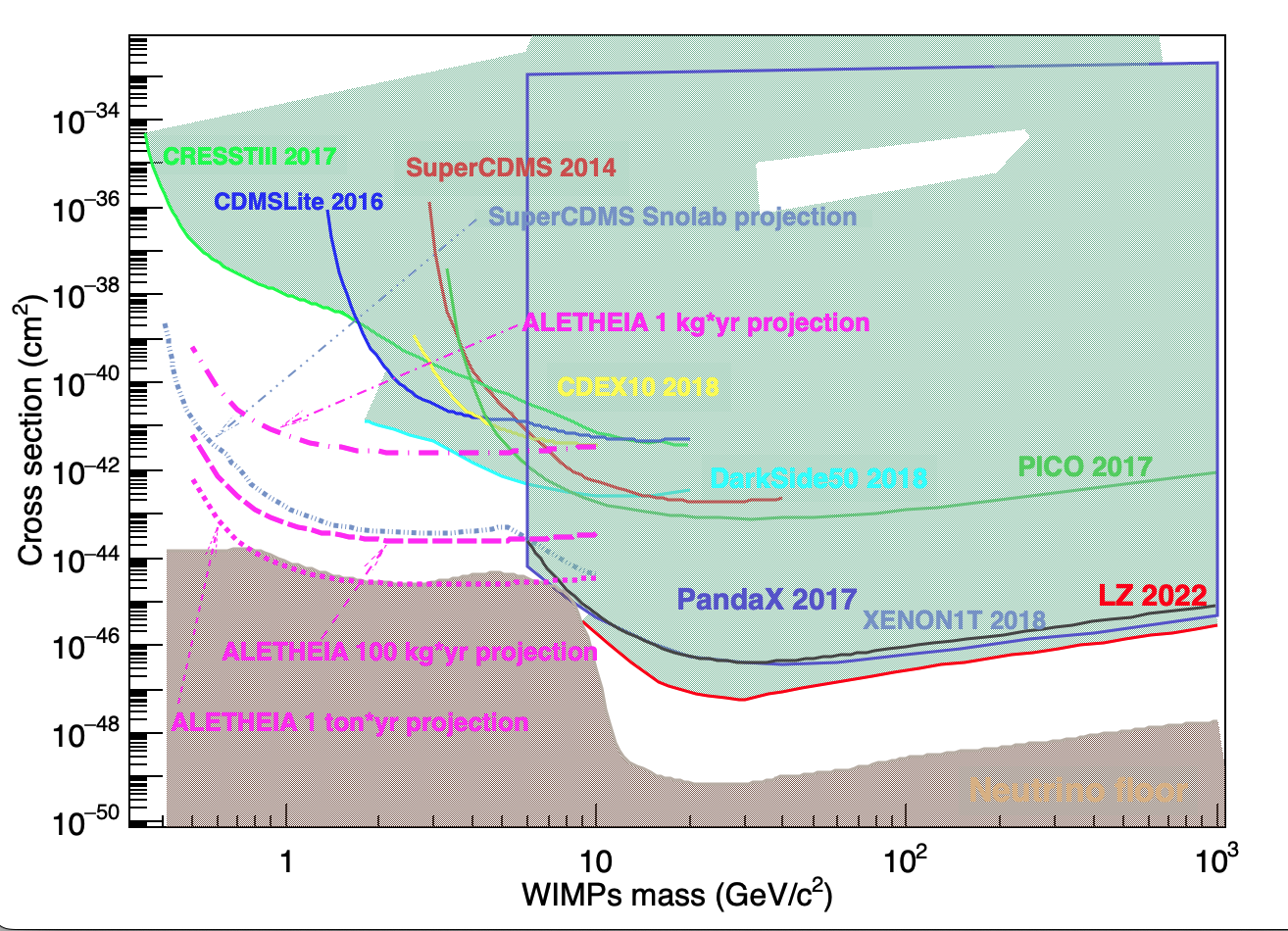
You need to start and end your TGraph with a the same point, otherwise is difficult to foreseen how to the Graph will be filled. So there are not overlapping region creating the white spots you are experiencing.

Moreover from the physics point of view the exclusion after a limit should be vertical and not diagonal.

I suggest you to your exclusion text file three point,

  • one at the beginning of the file with the same x of the first point and y =1e-33.
  • one at the end of the file with the same x of the last point and y =1e-33.
  • add a copy of the first point you added after the last line of the file.

this should be enough to draw proper exclusion limit.

Stefano

PS
You should add the target considered for the Neutrino floor.
Have a look to this TGraph constructor, it will make your life much easier

You may consider using the Exclusion graph facility.

Hi Stefano,

Thanks for your suggestions.
Unfortunately, it doesn’t work as expected.
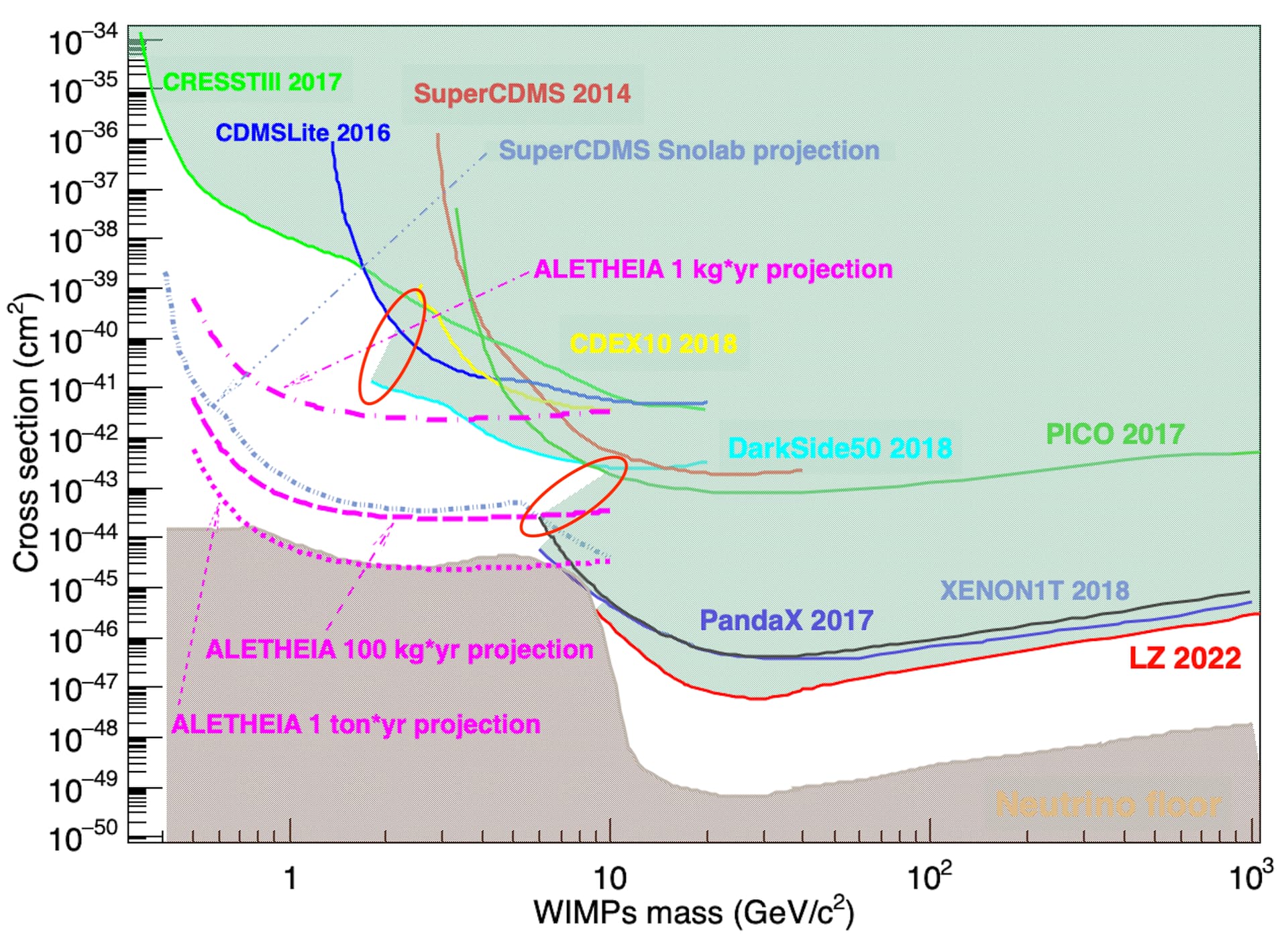
As an example, I just chanced the PandaX 2017 curve according to your idea of adding three points. The attached plot shows the change.

BTW, your suggestion on the Graph constructor should be a good one, but haven’t tried it yet. My code was sort of old-fashion thing.


Thank you anyway.

Best,
Jun

Hi Couet,

Thanks for your message.
My code was exactly the method you suggested.

Best,
Jun

Try to draw with "AL"option instead of "AC". C option makes the curve smoother but it creates some artifacts.

Hmm, doesn’t work either, thanks though

I think I got it.
I checked your code and old code of mine where I did almost the same thing.

All the exclusion plot were line with standard width without 99 or -99 in front and no fill color.

Then I add another TMultiGraph where I added the neutrino floor and the total exclusion background.

For the total exclusion background I created an additional file following the exclusion profiles of the various experiments. Is a quite long procedure but in the ends it works.

Best
Stefano

Hi Stefano,

I believe I understood what you meant.
Making a sort of combined exclusion limits is a solution, but hard to say it is an elegant one, to be honest.

Could it be possible for ROOT developers to update the code to cope with the issue?

Thanks.

Best,
Jun

I think the exclusion area became messy when it is to large. If do:

    TGraph* gr10 = new TGraph(nf10,array_wimp_mass_10,array_xs_10);
    gr10->SetLineColor(12);
    gr10->SetLineWidth(3005);
    gr10->SetFillColor(30);

I get:


Which is fine. 99 (and even some smaller values) makes it confused.

This topic was automatically closed 14 days after the last reply. New replies are no longer allowed.