Dear @moneta
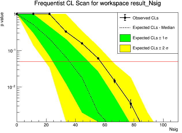
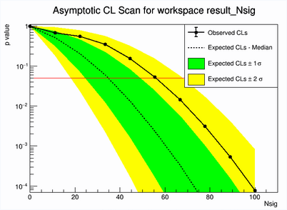
I have extracted upper limit on Number of signal counts for Model = (Gaussian signal + poly Bkg) by using both the frequentist and Asymptotic profile likelihood method. The upper limit and experimental sensitivity values from both methods are quite reasonable and matching with each other but i don’t understand why p value plot for frequentist approach is not so smooth as asymptotic one. Is it fine, if its like this, i mean not so smooth.
I tried frequentist approach for 500, 1000, and 5000 MC toys. The p value plot shown below is for 5000 toys. Should i generate it for more toys or is it fine like this?
Thank you!
