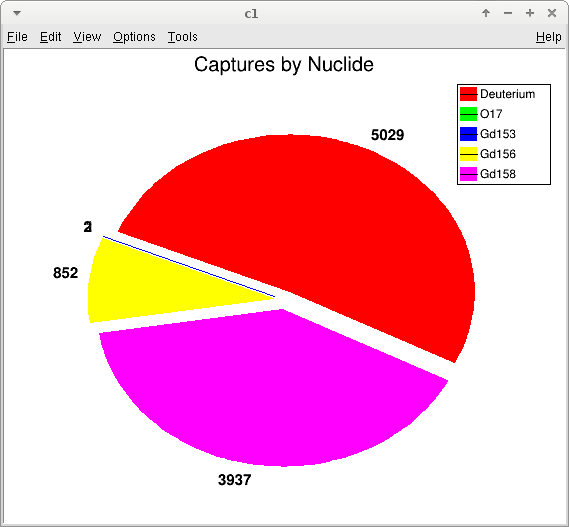
Reducing the amount of information shown and moving the labels to a legend (along with changing the default colors, which are all very similar?) helps:
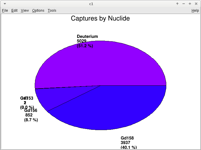
But even now there are still two entries (O17 and Gd153) whose labels overlap and whose slices aren’t distinguishable - even if you can identify that there are two numbers there, and what they are, you can’t tell which is which.
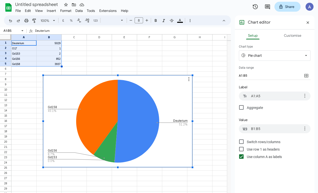
Google sheets does this with no configuration:
Which is a pretty good way to separate out the labels without overlap. The only flaw, in fact, is that the O17 entry seems to be entirely missing…!
Anyway, surely there’s some way to draw a pie chart that’s readable, preferably without (although i can’t even do it with) fine tuning the plot for the specific bin contents…?
Are you sure that a pie chart is the best way to represent your information here ?When distribution entries start varying across orders of magnitude, logarithms are helpful.
Well, in this case it’s a breakdown of what fraction of neutrons captured on various nuclei; we expect ~50% on hydrogen and ~50% across a few gadolinium isotopes, so a pie chart seemed like a good way to show that. The other isotopes are edge cases, hence the small numbers, but I think they’re interesting all the same. I’m open to an alternative suggestion, but since there’s a TPie class it would be nice to get a good plot out of it, regardless of whether that’s the “best” way to represent the data.
The current implementation of TPie does not support the arrows style Google provides. But as @Eddy_Offermann said, if some of your slices are not bigger than a simple line, does it make real sense to use a Pie Chart to represent your data?
I’m not sure what would be more suitable, but ok, i’ll give up on TPie for now. As a final note, though, I will point out that even the demonstration pie chart on the TPie class reference page, with no small slices, still suffers from this issue.