I tried that one indeed. But it doesn’t produce plots close to what I want.
For a single circle, it produces a plot of which top view is attached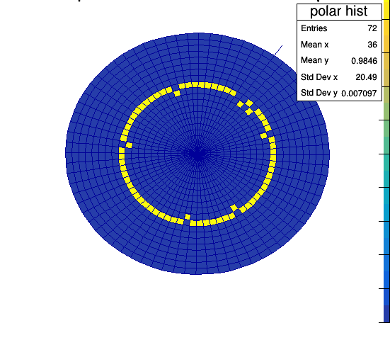
So, what you see is, x value is represented by the number of divisions in the phi plane, which is what I want, but y value is represented by the radius, and not by the color.
I wish that y value is not represented by radius, all the y values will have the same radius but differ only in color corresponding to their value.
Radius will be assigned to different circles.
Closest to what I demand is done only by one person, zhiyi, in this topic. Maybe I should have a contact with him. Plot polar TH2