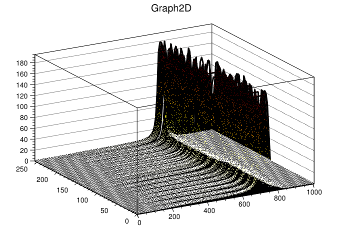
I am drawing a TGraph2D, as on attached plot. The problem is, that the lines and markers seem to be partially transparent - you can see most of the lower parts behind the peaks through the peaks. This is not a matter seeing through the breaks between lines, because for line size of 15 the problem is the same. The same also, if I set a marker size to very big. Does not matter if I use GL back-end or not. The same effect is in stored png and pdf, as well as on the screen. So I guess, it must be a feature. How can I turn it off?
Unless you asked explicitly for it there is no transparency involved in that kind of plot. Can you provide a macro we can run ? I am not sure to fully understand what your problem is exactly.
I modified a bit your macro to not have input parameter:
f = ROOT.TFile("tree.root", "read")
t = f.Get("tcal")
and I did:
$ python draw_all_scurves.py
It gives me:
$ python draw_all_scurves.py
Traceback (most recent call last):
  File "draw_all_scurves.py", line 7, in <module>
    fn = sys.argv[1]
IndexError: list index out of range
I just downloaded the stuff I posted here, changed the 7th line to fn = “tree.root”, ran and I get the result. I can just add some debug output to see if you get the arrays filled from the TTree, but I see no point why you wouldn’t… Unless there is a difference in plotting options between your and mine version of root…
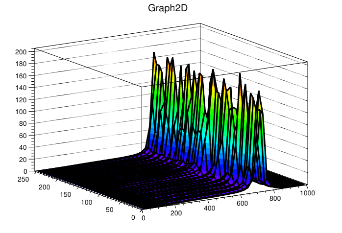
In general, I would like to have TMultiGraph with “l3d” option, that changes the color of the line according to Z, same as “pcol” does for markers. I’ve seen it in some other package and it would really help here. But since this is not available, I try to work with markers/surfaces.
surf/tri would work, if it was not so terribly slow on root 5. I can’t switch to root 6 because of lack of windows compatibility that I have to maintain (and, at least ~1 year ago, when I checked, pyROOT GUI examples were not working, so…).
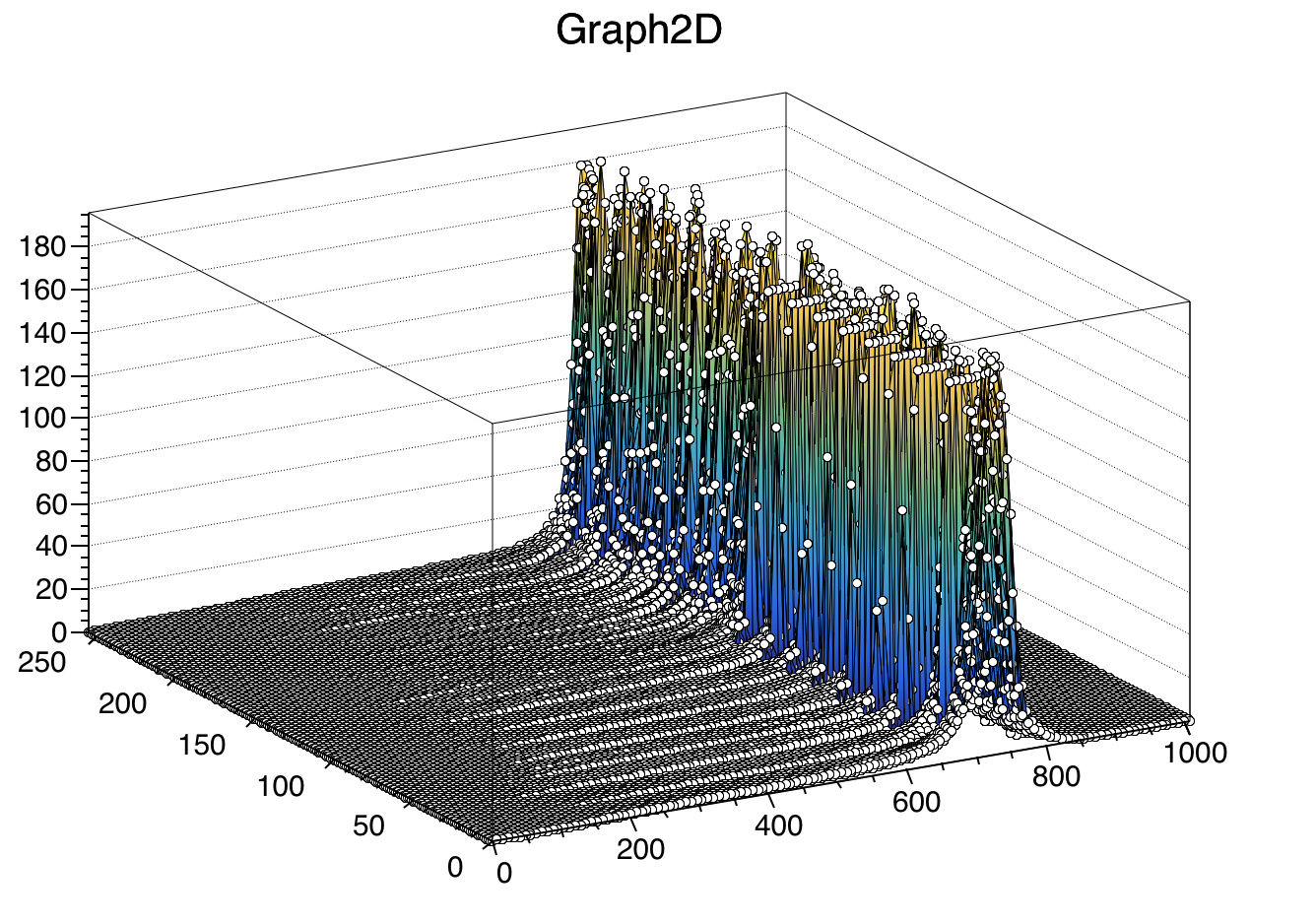
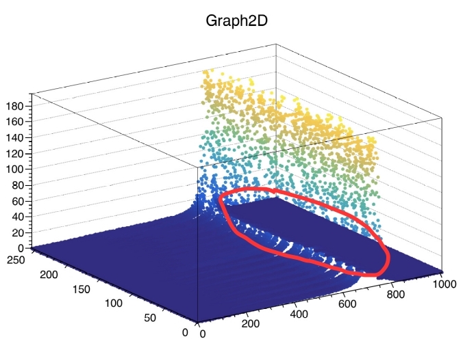
So I would go for pcol, perhaps with line as I was doing (since surface drawing is so slow), but in your screenshot it also looks wrong, I think. In the area that I marked on the attache dplot, the dark blue markers which are behind the lighter blue markers that belong to the peak, are drawn over the light blue markers. At least, the light blue markers are not visible in the marker area, while they should be.
I see. Which means that I can’t really look at the back or the front of the plot if I rotate it. I was expecting similar behaviour as with surf plots. Would you consider in the future uniformising this behaviour, or do majority of users expect markers to be drawn according to order of adding, not geometrical placement?