_ROOT Version: 6.22/06
_Platform: Ubuntu Compiler: Not Provided
Hi All,
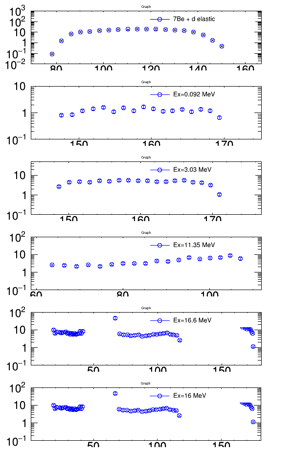
I want to generate a plot like the attached figure (with common x axis and x label, common ylabel). I would really appreciate any help for sharing a template for this sort of plot.
I am using the following macro which produces the attached plot. canvas3.C (12.2 KB)
The spectrum generated has vertical separation between the different plots unlike what I have attached in my query. Also I am unable to add a common x label and y label for the complete spectrum.