Hi,
I am currently trying to create double logscale plots of some histograms with a ratio-plot of these histograms underneath. Since I only want to label one x-axis, they should be identical in both pads. I want them to be in a range from 0 to 200. Of course I used SetRangeUser() and also SetLimits().
The Problem is, that the upper plots x-axis starts with a tick at 10^-2 while the ratio plots x-axis starts at 10^-1.They both correctly end at 2*10^2. I am aware of the problem, that logscales cannot include 0, so i tried to start at 10^-50 but this also doesn’t lead to uniform x-axis.
So I wonder if there is any possibility to choose the shown decimal powers manually?
For creating those plots, I am using a Python-function:
def draw_spectra_with_ratio(hists1, hists2, ratio_hists, colors, output_path, x_title="R#ddot{u}ckstossenergie (keV)", y_title="Ereignisse / (0.02 keV)", x_min=0., x_max=200., y_min=None, y_max=None, ry_min=0.8, ry_max=1.2, percent_band=5, logscale=0):
c1 = ROOT.TCanvas()
c1.Divide(1,2)
if logscale == 1:
c1.GetPad(1).SetLogy()
if logscale == 2:
c1.GetPad(1).SetLogy()
c1.GetPad(1).SetLogx()
c1.GetPad(2).SetLogx()
c1.GetPad(1).SetPad(0.,0.3,1.,1.)
c1.GetPad(2).SetPad(0.,0.,1.,0.3)
c1.GetPad(1).SetBottomMargin(0.02)
c1.GetPad(2).SetTopMargin(0.05)
c1.GetPad(2).SetBottomMargin(0.4)
c1.GetPad(1).SetGrid(0,0)
c1.GetPad(2).SetGrid(0,1)
c1.GetPad(1).SetFrameLineColor(ROOT.kGray+2)
c1.GetPad(2).SetFrameLineColor(ROOT.kGray+2)
ROOT.gStyle.SetOptTitle(0)
ROOT.gStyle.SetOptStat(0)
#Draw 5% band
c1.cd(2)
x=[x_min, x_max]
y=[1., 1.]
xe=[0., 0.]
ye=[0.01*percent_band, 0.01*percent_band]
Area = ROOT.TGraphErrors(2,np.array(x),np.array(y),np.array(xe),np.array(ye))
#Area.GetXaxis().SetLimits(x_min,x_max)
Area.GetXaxis().SetRangeUser(x_min,x_max)
Area.GetYaxis().SetRangeUser(ry_min,ry_max)
Area.GetYaxis().SetTitle("Verh#ddot{a}ltnis")
Area.GetXaxis().SetTitle(x_title)
Area.GetXaxis().SetTitleSize(0.03*1./0.3)
Area.GetYaxis().SetTitleSize(0.03*1./0.3)
Area.GetXaxis().SetTitleOffset(1.3)
Area.GetYaxis().SetTitleOffset(0.5)
Area.GetXaxis().SetLabelOffset(0.03)
Area.GetXaxis().SetLabelSize(0.03*1./0.3)
Area.GetYaxis().SetLabelSize(0.03*1./0.3)
Area.GetXaxis().SetAxisColor(ROOT.kGray+2)
Area.GetYaxis().SetAxisColor(ROOT.kGray+2)
Area.GetYaxis().SetNdivisions(505)
Area.GetXaxis().SetTickLength(0.01*1.0/0.3)
Area.GetYaxis().SetTickLength(0.02)
Area.SetFillColor(ROOT.kYellow-8)
Area.Draw("E3AL")
Line = ROOT.TLine()
Line.SetLineColor(ROOT.kGray+1)
Line.SetLineStyle(2)
Line.DrawLine(x_min,1.0+0.01*percent_band, x_max,1.0+0.01*percent_band)
Line.DrawLine(x_min,1.0-0.01*percent_band, x_max,1.0-0.01*percent_band)
for i in range(len(hists1)):
c1.cd(1)
hists1[i].GetXaxis().SetRangeUser(x_min,x_max)
#hists1[i].GetXaxis().SetLimits(x_min,x_max)
if y_min and y_max:
hists1[i].GetYaxis().SetRangeUser(y_min,y_max)
hists1[i].GetXaxis().SetTitle("")
if y_title:
hists1[i].GetYaxis().SetTitle(y_title)
hists1[i].GetXaxis().SetTitleSize(0.03*1./0.7)
hists1[i].GetYaxis().SetTitleSize(0.03*1./0.7)
hists1[i].GetYaxis().SetTitleOffset(1.15)
hists1[i].GetXaxis().SetLabelSize(0.)
hists1[i].GetYaxis().SetLabelSize(0.03*1./0.7)
hists1[i].GetXaxis().SetAxisColor(ROOT.kGray+2)
hists1[i].GetYaxis().SetAxisColor(ROOT.kGray+2)
hists1[i].GetXaxis().SetTickLength(0.01*1.0/0.7)
hists1[i].GetYaxis().SetTickLength(0.0125)
hists1[i].SetLineWidth(2)
hists2[i].SetLineWidth(2)
draw_hist(hists1[i], colors[i], 1)
draw_hist(hists2[i], colors[i], 2)
c1.cd(2)
ratio_hists[i].SetLineWidth(2)
draw_hist(ratio_hists[i], colors[i], 1)
c1.Print(output_path)
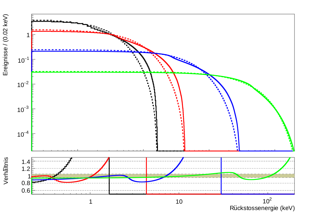
c1.Print(output_path+".root")A picture showing the results is attached.
Thanks in advance,
JMC