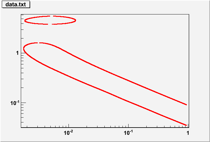
I have a text file where on each line there are the values x and y (data.txt).
All the (x,y) points correspond to a limit exclusion curve.
I would like to plot it. I should get something like in the the attachement (example_limit.pdf),
obtained in a completely different way.
I tried with TGraph, TPolyLine but when I draw with the option L I get something bad.
I think I need a sort function that finds the closes points but I didn’t find.
Is there any other way to do that?
Hello, your problem comes from the fact that you use “L” option since you data are not sorted
This is what I get with this macro
[code]{
gPad->SetLogx(1);
gPad->SetLogy(1);
TGraph *g = new TGraph(“data.txt”);
g->SetMarkerStyle(7);
g->SetMarkerColor(kRed);
g->Draw(“AP”);
}[/code]
Anyway, even if you sort your points, you will still have this line between the two “circles” (on the right on your figure). To avoid it, you can use “AP” option, as I did or define two different TGraphs.
The thing is I would like to get two continuos curves without any break. So I tried with L option.
I think that also doing Draw(“AL”) with two different TGraph I get the filled black area, even if
I didn’t give any kind of option to do that (I put a zoom of my plot).
no, TGraph does not sort the points it takes them in the order you put them in the file. In that file one point is on one side of the contour and the next one on the other side. That’s why you get this filling effect.