Hi,
I have a two dimensional histogram which I fit using a two dimensional fit function (see figure below)
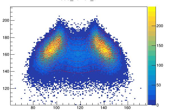
Here for visualization is it possible to adjust the distance between the different fit contours, for better visual representation ?
Thank you!
Hi,
I have a two dimensional histogram which I fit using a two dimensional fit function (see figure below)
Here for visualization is it possible to adjust the distance between the different fit contours, for better visual representation ?
Thank you!
I think you should use solid line to improve the visualisation
The problem is if I use solid lines it somehow masks the data points …
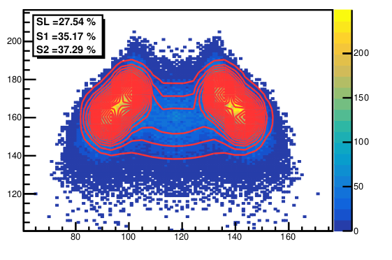
yes but it is more clear. Change the number of contours to have less of them.
How can I change the number of contours… all I have done is fit the distribution using a user-defined function…