Hello RooStat experts.
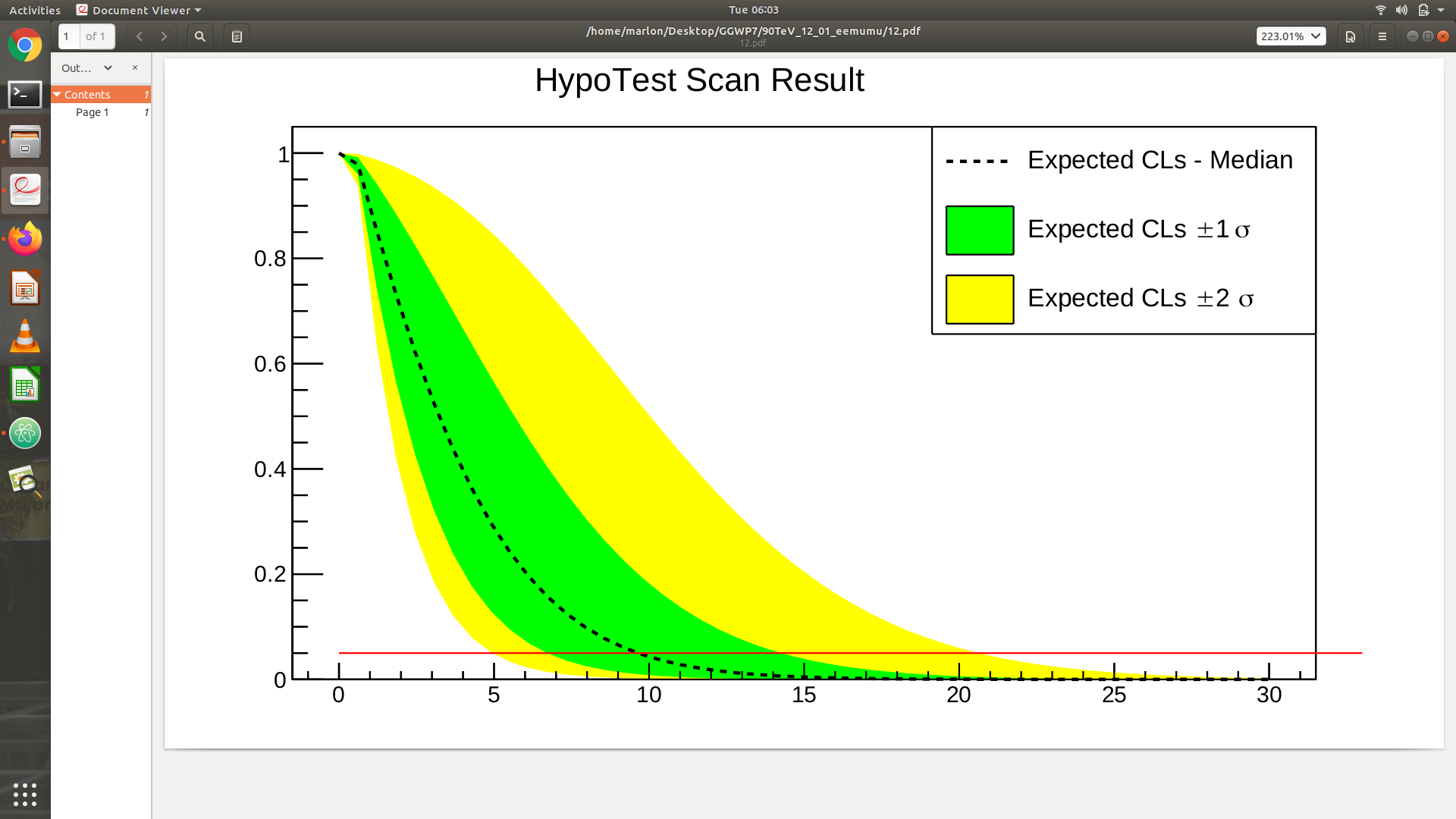
When i try run the HypoTestInverter, i got the following plot,
with a value of median expected of s = 9.65. Can anyone gimme some insights of how this plot is created? I mean how come s = 9.65 is the point at which the cumulative probability distribution crosses the quantile of 50%
cheers.
Marlon
Hypothesis tests yield confidence levels, p-values or significances.
If you want a limit ("which value of s is compatible with a confidence level of 95%). You therefore invert the hypothesis test by performing a bunch of hypothesis tests for different values of s. You then find the point where it crosses the 5% (or the 95%) threshold - that’s your limit.
The HypoTestInverter does exactly this. It takes your likelihood model, evaluates the p-values for different values of s, and that’s the dashed curve. The intersection with the 5% line is calculated numerically.
To estimate the systematic uncertainties of your model, you can repeat this calculation for the case that the thing you want to measure (e.g. signal cross section) varies by ± N sigma. That’s the bands.
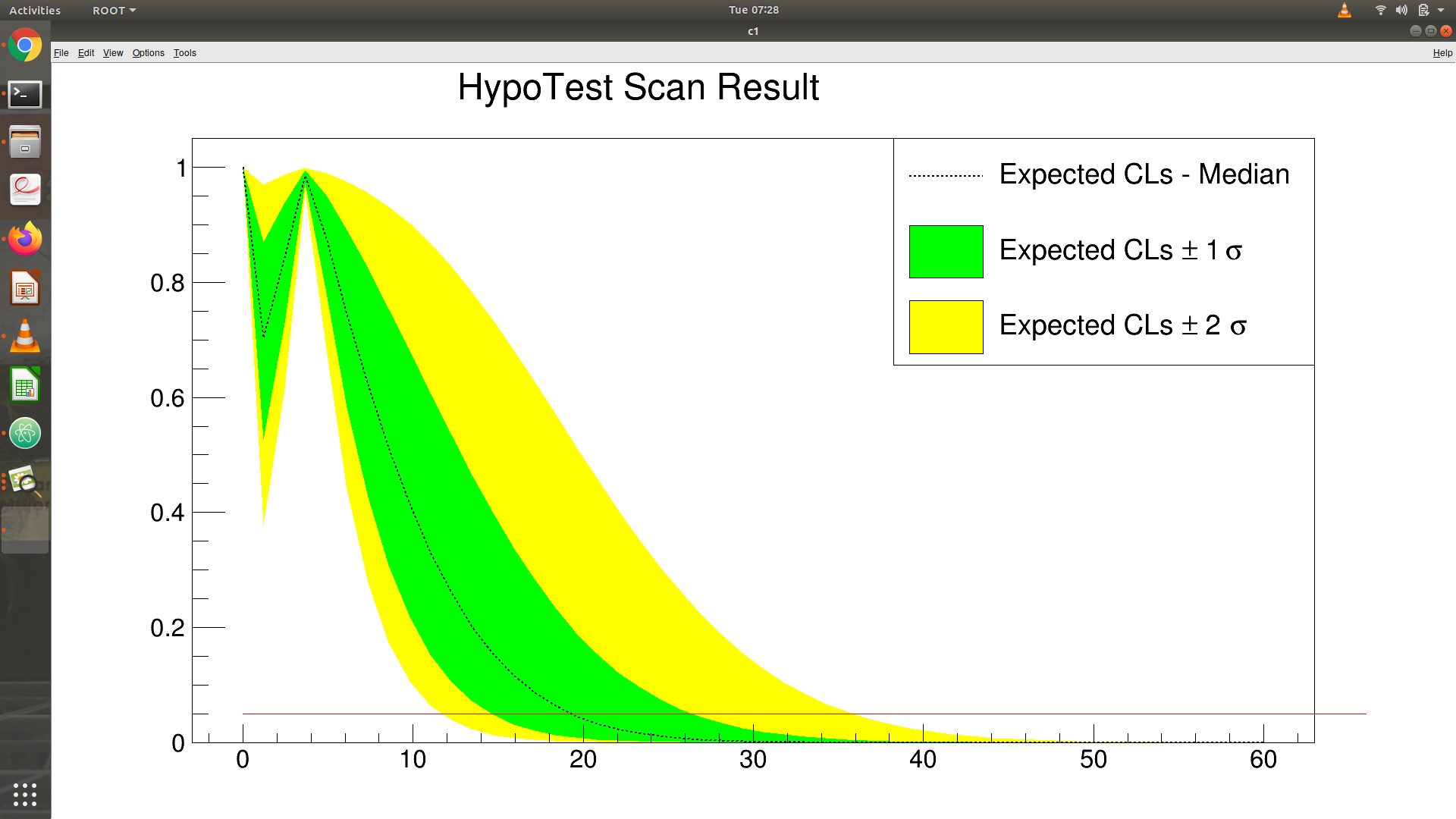
Hello sir, thank you for your response. By the way from my other configurations i get this following hypotestplot
.
Can you give me some insights what happen to s values from (0-7), why expected in this range moves down and moves up again?
Cheers.
Marlon
This is usually a failed fit. Check the fit logs, or do a fit manually with this exact value of s.