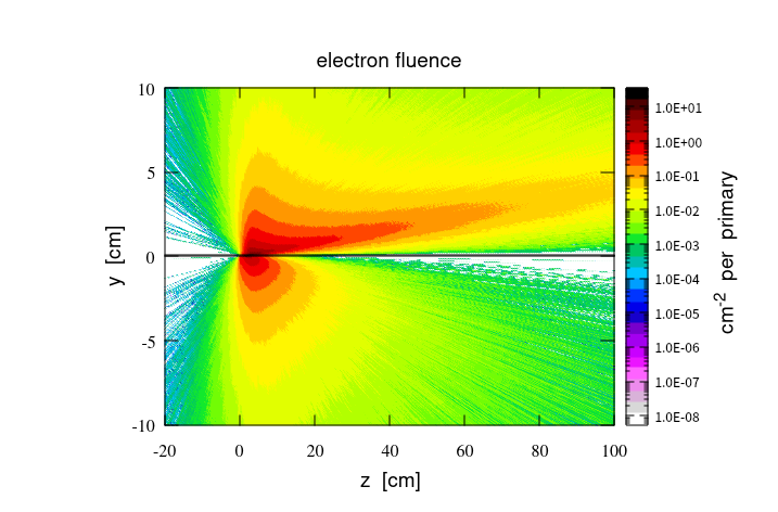
Thank you .And I want to know how to control the scale of the z-axis in logarithmic form , like in the first picture,from 1.0E-0.8 to 1.0E+01.Can ROOT achieve such a function?
Look at the way TColor::CreateGradientColorTable() is working . You can define the color change at the exact position you need. Simply put them where needed for your case.
const Int_t Number = 6;
Double_t Red[Number] = { 1.00, 0.00, 0.00,0.00, 0.50, 1.00};
Double_t Green[Number] = { 0.00, 1.00, 0.00,0.00, 0.00, 1.00};
Double_t Blue[Number] = { 1.00, 0.00, 1.00,1.00, 1.00, 1.00};
Double_t Length[Number] = { 0,1.0E-08, 1.0E-06, 1.0E-04, 1.0E-02, 1.0};
Int_t nb=100;
TColor::CreateGradientColorTable(Number,Length,Red,Green,Blue,nb);
h1->SetContour(nb);
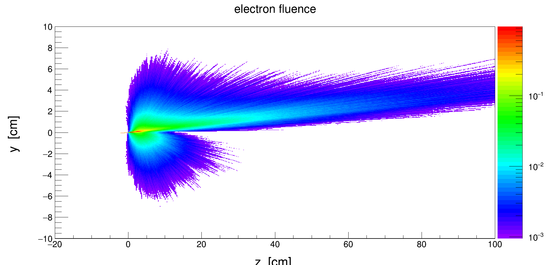
Is my code correct?Maybe it’s my data problem.But I still want to know if there is a way to manually adjust the range of values displayed on the z-axis?They always set it automatically.Like the second picture, I want to display more scales, such as 1.0E-4,1.0 E-5,etc. Is there any way to achieve this?
Thank you very much!
the dynamic of the two plots are different. On the 1st plot you have 10 decades and on the 2nd one 3. Change the minimum and the maximum of your histogram to match the 1st plot ones and you will get more decades.
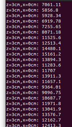
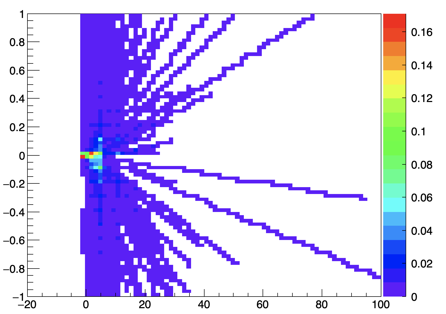
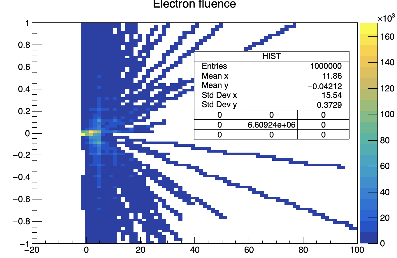
I encountered a problem when plotting a 2D histogram using h1->Fill(z, x, a) , where z and x are coordinates, and a is the value of the fluence. The results show that the data range is between 0 and 3, which is not the case. I can see from my txt file that the flux values are very large. So, I would like to know if the 2D plot generated by ROOT truly reflects the actual data size, or if there has been some data processing operation that I am unaware of. zy3.pdf (328.6 KB)
The reason there is a large amount of data is because I am plotting the flux on the zx plane, and along the y-direction, I have divided it into 100 grids. Therefore, each zx point has 100 flux values accumulated together. From the graph, it is evident that the flux values are very large, and it is impossible for them to be between 0 and 2.