Hi!
I hope this question hasn’t been asked yet, searching through the forum I didn’t find anything similar to what I need.
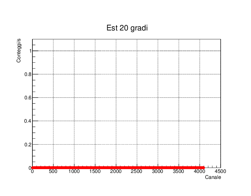
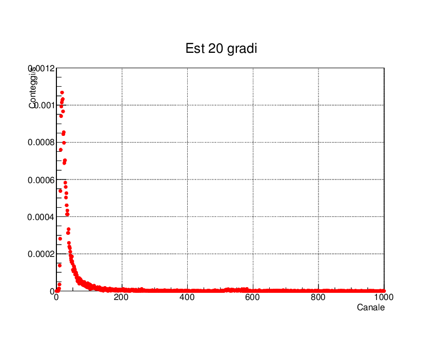
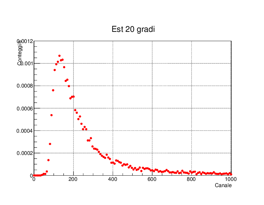
I have a graphic with the canals (tiny intervals of energy, they figure simply as integer numbers:1,2,3,…) on the x axis and the counts per second (of cosmic rays with energy falling in a certain canal) on the y-axis.
I need to reduce the number of points of my graphic, by grouping different points and summing the respective counts together to obtain only one point. (This should be the same as enlarging every canal so that it includes also the nearest points, which I cannot do since the canals are integer numbers on this graphic).
I tried to do that by building a histogram, associating each column to a canal and its height to the number of counts relative to that canal. Then I used the function Rebin(int n) of TH1 in order to group n bins together to obtain one, and by doing so I successfully managed to sum different counts together in only one bin and, reconverting into a graphic, obtain a smaller number of points.
The problem is that by using Rebin() the graphic was also shifted to smaller values of the x-axis, as a result of the grouping of the points: apparently the function Rebin() begins to merge the bins of the histogram from x=0 on, and since the total number of bins is reduced they extend for a shorter length on the x-axis. (I hope I am not making it too difficult to understand).
Does anyone know if there’s another way to reduce the number of points of my graphic by grouping the near ones together (maybe without using a histogram), without shifting it to smaller values of the x-axis?
Thank you!
P.S. Maybe is there simply a function of TF1 that does that directly? I tried to search but I couldn’t find anything.
Yes what you describes seems to be a good use case for Rebin().
I am not completely sure I fully understand what is your problem with the X-axis. I just tried to rebin interactively an histogram. What it does is to keep the axis limits on the X axis and decrease the number of bins as it groups them. Bins are grouped and therefore the bins contents of the resulting bins increase. What I see in perfectly normal. I do not recognise something similar as you describe here. May be you can provide a small script showing what you get ?
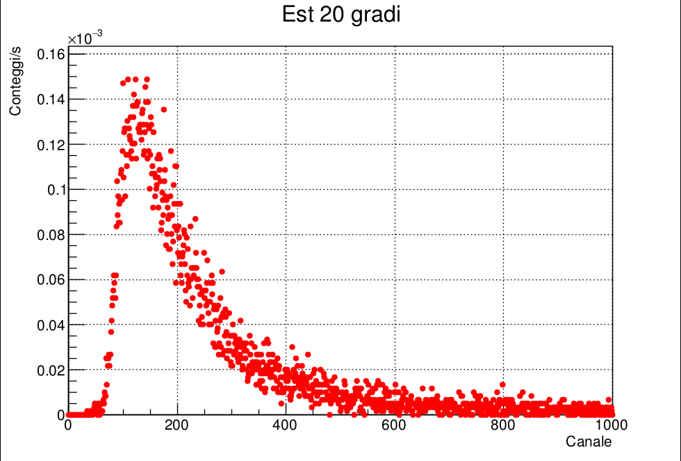
I think I can explain best what I mean by showing you directly the graphics (I’ve set the same range on the x-axis for clarity, while on the y-axis the ranges are different, but it shouldn’t matter)
As you can see the first one (that is the one I get after reducing the number of points using Rebin(8) ) is shifted to the left, in other words the first graphic is more concentrated on the first canals, while I need the “form” of the graphic to stay the same, just with less points.
UPDATE: While writing this answer I realized that the reason why I get this is probably due to how I assign the values to the points of the new graphic, and not to Rebin(). You’re right, Rebin() does exactly what I want and infact I get a perfect histogram, but after that I build in order the new (fewer) points with TGraph, so of course the graphic is concentrated on the first canals. Sorry, I didn’t realize that
So now I have a new problem: how can I now build a graphic of points that covers exactly the same canals as the first one, but with fewer points? I’ll try to figure it out, if you have any idea please let me know
I managed to obtain my graphic I just summed 8 (which is the quantity I used in Rebin() ) to the variable associated with the canal number at every cicle of while(1), during the process of creating the new points, so that every point is separated by 8 along the x-axis and the proportions of the first graphic are restored!
I guess, problem was the following.
When TGraph is drawn, special histogram object is created, which used only to display X/Y axes.
And when you did Rebin, you only change configuration of the axes - not the original TGraph.
Therefore you saw such strange behavior.
{
  TGraph *g = new TGraph();
  g->SetTitle("Est 20 gradi;Canale;Conteggi/s");
  g->SetMarkerStyle(kFullCircle);
  g->SetMarkerColor(kRed);
  double v, x, y = 0.0;
  int i = 0, k = 8; // how many points should be combined
  std::ifstream f("Est20.txt");
  while (f >> v) {
    i++;
    y += v;
    if (!(i % k)) {
      x = i - k / 2.0; // x -= 0.5;
      // x /= k;
      // y /= k;
      g->SetPoint(g->GetN(), x, y);
      y = 0.0;
    }
  }
  std::cout << "Number of found data points: " << i << std::endl;
  g->Draw("AP");
  gPad->SetGrid(1, 1);
}
Thanks linev !
The fact is that I built TGraph only after building the histogram and using Rebin(), in a completely separate way, so I don’t think Rebin() had anything to do with the strange form of the graphic.
(If I understand correctly what you say).
It was just me assigning fewer points to the graphic and expecting them to be distributed in the same way as before


 If perhaps some of you have other ideas on how to obtain the same result, maybe in a more rapid way, please let me know!