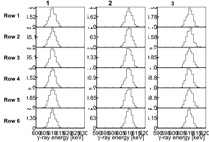
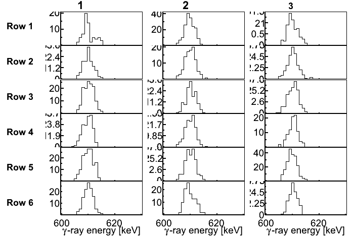
I’m trying to make a figure but fails… I’ve attached a script and the output of it. The problem is of course that I can’t control the number of ticks and/or which labels are written next to the axis. In my example I would like something like one or two labels for y, but not 0 nor maxvalue as this interferes with the histogram above or below. For x I would like labels such as 595 and 615, but thats is!!!
thanks for the help, although it is a bit fragile. I changed the script so that it fills the histogram with a random number of entries between 60 and 6000 (as opposed to the 600 before). And then the y axis again becomes somewhat difficult to control. Is there a general way to do what I want? Can’t I tell an axis I want a label every 20 or something like that?