a) For transparent boxes, I agree that there is no obvious solution to overcome the buggy behaviour. Better not using any stroke, as now.
b) For solid (NON-transparent boxes), we have now the workaround of the stroke, which works nicely.
What about combining both types on the same plot? What alberto points out is that if you have a 2D histogram of type b) as “background” and overlay on top a histogram of type a) (transparent), then the rectangle size of (a) is not equivalent to rectangle size of (b).
In general, this mismatch has no visible effect, because overlapping solid bins shadow each others stroke. However, if you have “edges” in your (b) solid histogram, i.e. white bins that do not have any content, then the stroke of contiguous non-zero bins (edge bins) becomes evident. This is, this edge bins have an “visible” larger area than the rest ones.
So the mismatches in area (or boundary) of a top transparent rectangle (a) over the “EDGE” background solid rectangles (b) are seen, as described in: root.cern.ch/phpBB3/viewtopic.p … =60#p82936
As far as I understood from his post, the problem is not in the transparent (a) histogram, which is ok to not have any stroke, but rather in histogram (b). If there would be a way to control the stroke width of (b), i.e. make it thinner, then the mismatch with respect to the corresponding rectangles in (a) would become less evident. But I can understand this might be technically difficult and for a very special and intricate application of a buggy workaround for a reduced amount of users. Maybe alberto can just hack the TPDF class for his own histograms by using thinner stroke widths through the trick suggested in my previous post.
Making the stroke thinner in TPDF is easy. I can tell you what to change if you are willing to test it. Or, if you prefer, send me the (a) macro showing this effect and I can test it.
I have made a new version of TPDF which makes very thin stroke line when the boxes are filled with no transparency. The file is attached. May be you can test it Alberto ? TPDF.cxx (78.2 KB)
Don’t worry, it was a simple change in TPDF.h.
OK, I am testing it and it looks better than ever: Snapshot1-rake-v10kA.G.SR2.RI.3D_20.pdf (296 KB)
Now the boundaries of the bins are much closer to each other for both transparent and non-transparent histograms:
However, I have noticed another effect in the plots from another program that I have: final_500pC_S2E_R56-max-p3x3.pdf (25.6 KB)
You can see that there is something strange surrounding the color boxes in both the histogram and the z-palette.
Could be that somehow the stroke is drawn with some pattern (dashed line) in this last case?
The only difference that I can tell so far in respect to the other plots is that the firsts were made using a root macro and the last one with a compiled program.
Thanks Oliver, I think we are very close…
Oh yes… that’s right I should also reset the dash mode, otherwise it uses the current one.
Tried the attached .cxx. I set the line to solid and I do the stroke even thiner. TPDF.cxx (78.3 KB)
It works well! final_500pC_S2E_R56-max-p3x3.pdf (25.6 KB)
I like quite a lot the current behaviour with the thin stroke for alpha=1 and no stroke for alpha < 1.
This should be also implemented in PS output, doesn’t it?
Thanks a lot!
Thanks Alberto I will commit that.
It is already implement for PostScript.
In case of PostScript it is simpler because there is no transparency.
So I simply added a thin solid stroke around the solid filled boxes.
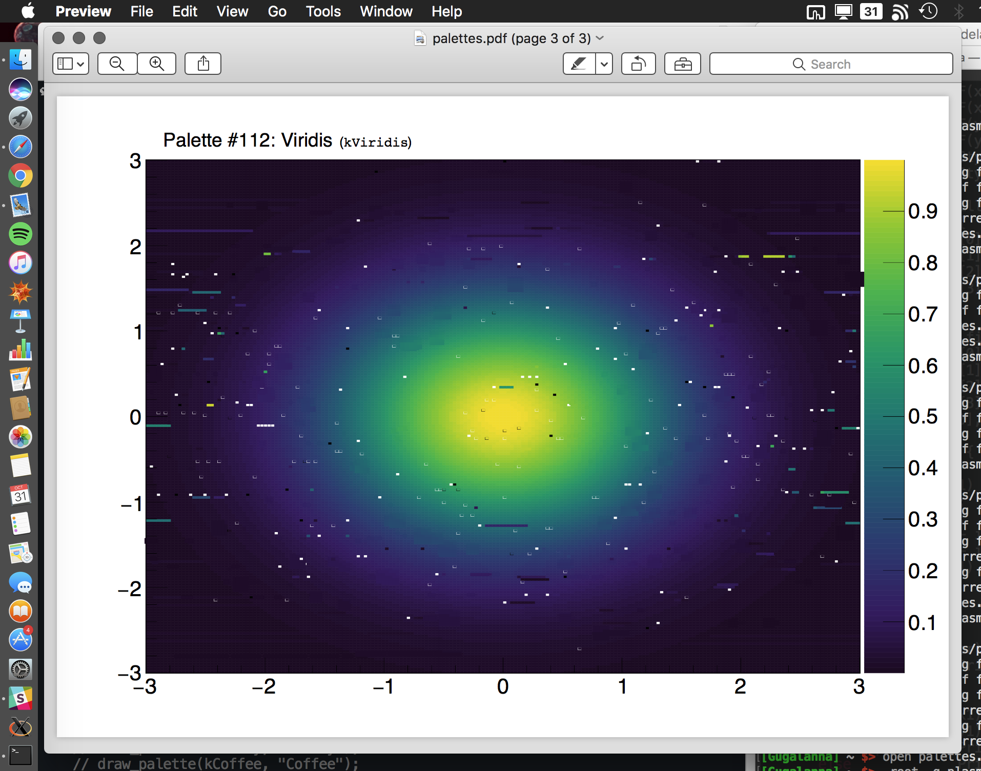
By the way I quite like the palette you are using in your plot but it looks like a rainbow one and I suspect it as the disavantages described here: root.cern.ch/drupal/content/rainbow-color-map
This thread has 7 pages … it is hard to tell to which item to refers … can you be more precise by posting a little reproducer ? I will be happy to fix it.
I am really sorry to inform that after the Mac os X update to Sierra,
the problem with color maps and pdfs is back.
That is, Preview.app do not render properly the separation between bins in a 2D “col” histogram.
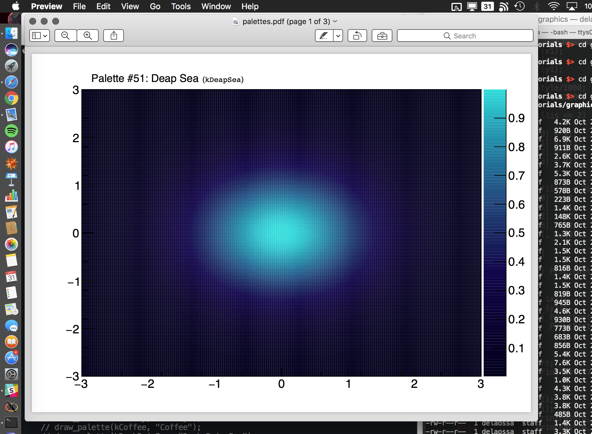
I am using the following macro for tests (adapted from $ROOTSYS/tutorials/graphics/palettes.C): palettes.C (4.14 KB)
It produces the following pdf output: palettes.pdf (585 KB)
This pdf looks bad in Preview.app from Mac OS X Sierra.
Because only the ones having an updated mac would realise about this, let me paste here a snapshot of the problem:
I have tried to make changes in TPDF.cxx to fix the problem.
More precisely, by changing the following values in TPDF.cxx:
if (fAlpha == 1) PrintFast(17," q 0.002w [] 0 d");  // (line 374)
if (fAlpha == 1) PrintFast(17," q 0.002w [] 0 d"); // (line 387)
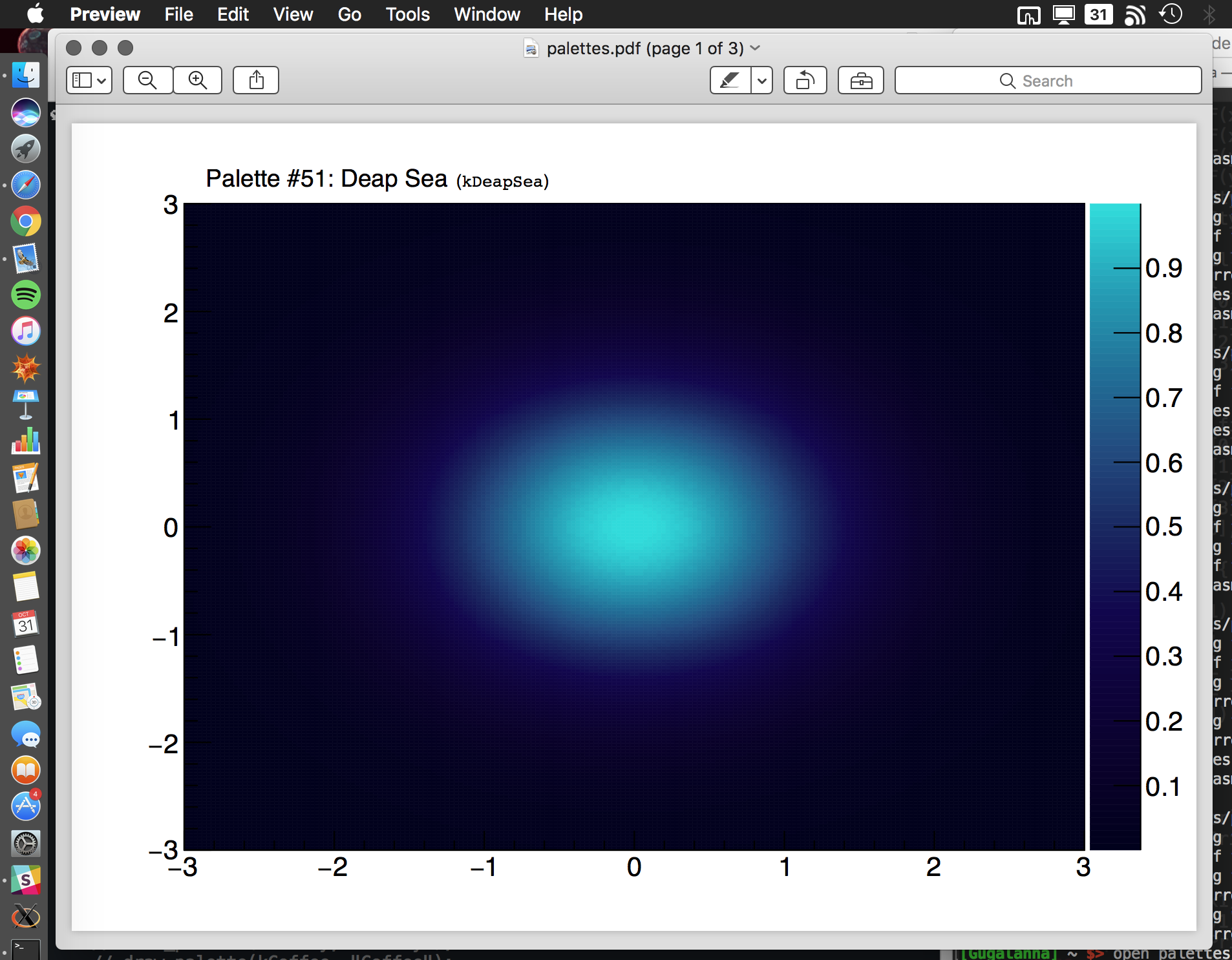
Going from 0.002w to 0.2w, I managed to get a better output:
Please, check the pdf: palettes.pdf (644 KB)
This “palette corruption” does not happen for values < 0.1, but a value of the “width” smaller than 0.1 is not sufficient to get rid of the “white lines”.
So I am stuck here with no optimal solution yet.
I am really sorry to bug you again with this problem, but it has a important impact in my research as the plots that I produce do not look good anymore on Mac machines.
I really would appreciate any help or ideas to try to fix this again. Thanks a lot.
Best regards,
Alberto
Hi Olivier,
Wow! yes, it has been fixed somehow.
I confirm that commenting that line out makes the plots looking as they should:
// if (fAlpha == 1) PrintFast(17," q 0.002 w [] 0 d");
However, I do not notice any change when changing from
if (fAlpha == 1) PrintFast(8," re b* Q"); to
if (fAlpha == 1) PrintFast(6," re b*");
By the way, let me ask if there can be a way of removing the white lines in case of fAlpha < 1 histograms.
Check this for instance: Snapshot10011-rake-v10kA.G.SR2.RI.3D_26.pdf (1.03 MB)
The color maps with fAlpha = 1 look great.
For the gray one I setup fAlpha = 0.8, so there is transparency and one can see the histograms behind.
The problem is that for this transparent case, the white lines are there.
This was also like this in previous versions of ROOT and Preview.app.
Do you have an idea on how to also fix this, so we have transparency and no white lines?
Maybe this is possible to do now that Preview has changed things.
Thanks a lot Oliver! You made my day again.
My message was not clear. The two modifications are part of the same change if you want to generate correct
PDF. Removing the line suppress the problem but the PDF code generated is not correct. “Q” should be removed because it was open by “q” in the removed line.
So I guess I will remove this trick as preview seems better now ? It looks like the bug report I submitted was somehow taken into account by Apple
Hi Olivier,
I am afraid that I still do not understand the change completely.
Would you post here how that piece of code should be looking entirely?
Also, I have realised that the output is slightly different than before because the stroke line surrounding the bin is somehow wider.
(You can see this in my previous plot by comparing the transparent bins on top of the non-transparent ones.)
As a side note if you open a PDF file with Preview and open the Preferences, you will see that in the PDF tab the toggle button to turn on or off the smoothing has disappeared. So somehow something as really changed in that area.
 for a reduced amount of users. Maybe alberto can just hack the TPDF class for his own histograms by using thinner stroke widths through the trick suggested in my previous post.