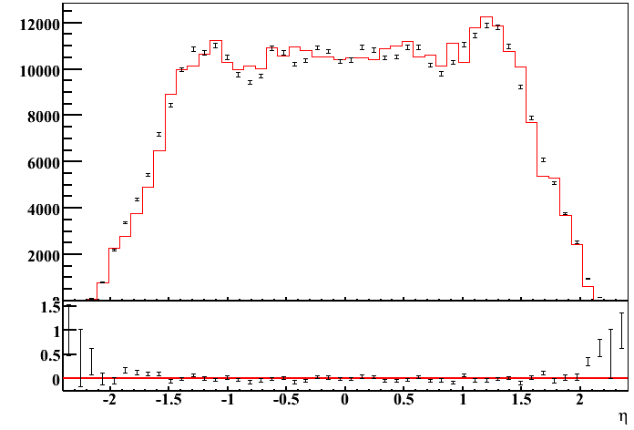
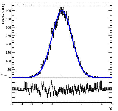
When drawing two pads near each other, one pad can overlap the axis label of the other, which looks a little sloppy. Is there any way to avoid this? I have attached an example plot. On the left, the ‘0’ on the axis is cut in half. By itself, it doesn’t matter too greatly, but with many of these plots it is annoying!
Are there any workarounds short of opening it up in an EPS or SVG editor?
One problem though. That’s just overlapping one canvas with another more to try and hide the label entirely. This also hides data points near the axis, which is also unacceptable…
Moving the minmum on the histogram just moves the 0 too. Is it really impossible to simultaneously not have the ‘0’ and to have data points that lie near the axis?
The bottom margin of a Pad (the top one in that case) is set to 0 there is no more room to draw the X axis labels an X title therefore they are clipped and that’s what you want. But also, the first label which very often goes below the X axis, is also partially clipped. If you changed the Y minimum (lower than the real one) your data will go up and you will be able to hide the partially clipped lower Y label without hiding the data points.
Yes. That is what I did, but it is not being clipped. You can see the line in my original code p1.SetTopMargin( 0.01 ); p1.SetBottomMargin( 0 ); p1.SetRightMargin( 0.01 ) where I set the margin to zero. I added an additional line to move the axis down by some fraction, but the zero just moves up with it.
Still seems a bit hackish, and I have to turn it off or on for different plots depending on whether they have the problem (or I risk transposing the problem to another label which is further up the canvas).
Also, another strange thing I observed was a small black line visible for a pixel below this ‘erase pad’. It seems that sometimes it doesn’t quite completely cover the label. And ROOT won’t let me set a negative position on the pad so that I can get rid of it
This exchange illustrates precisely that despite the many excellent options for putting pads and histograms together, that it is not possible to avoid the chopping of axis labels when pads/histograms are precisely aligned. The lasted plot show one have to resort to not showing the 0 on the vertical scale for the top plot.
In the current scheme ones has to introduce a small bottom margin between the two plots to see the labels fully.
On the other hand in the underlying TText that produces labels there are option to right/left top/bottom justify text. If this option/information could be applied to axis labels, the example discussed in this post could be easily solved.
The problem with the labels is not their horizontal positioning (which the axis label offset controls) but their vertical positioning. The lowest Y axis label on the top graph can be cut in half by the bottom pad, and likewise the highest Y axis label on the lower graph can be cut in half by the top pad.
The solutions proposed so far have been
a) to enlarge the lowest pad up a bit to clip the number entirely
- This leads to clipping of data, too
i) SetMinimum() on the graph so that the data moves up
- The axis label moves up too, negating enlarging the lowest pad
b) to occlude the number manually by drawing on top of it.
This is nasty. The original problem is not always a problem, sometimes the axis label is drawn a bit upwards, in which case manually drawing on top of it will cause the original problem again. So now it is necessary to manually choose for each plot whether they need to be manually clipped or not. When you have many plots, and the problem can happen on the upper or the lower plot, this gets to be a pain.
Let me make one more follow-up to the latest comment. The issue is the
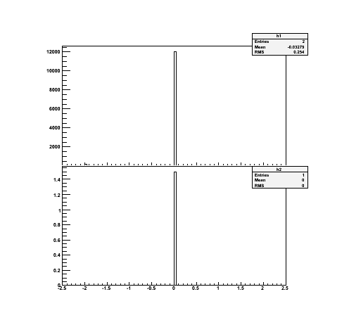
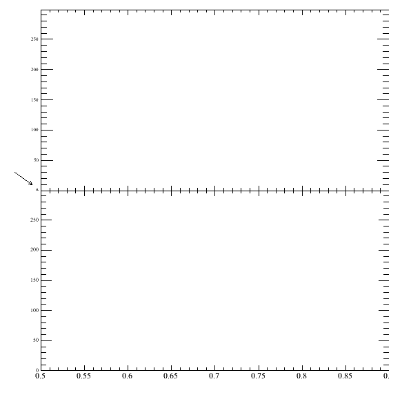
bottom alignment in vertical direction for y-axis and left-alignement in horizontal axis. I have a set of base-macros use to generate plots with multiple sub window (n= nxny) . Attached are two examples for a 21 divisions having same y-axis for both (no content only frames positioned on pads) one has the pads completely aligned, and here you loose 'half the 0
for the second label axis. If this ‘o’ text (and the 0.5 1 etc were left aligned they would all be within the pad for that frame (both one and two has a bottom margin to accommodate the axis title). The second display show you can regain good visual effects by introducing a small margin for the second plot.
This surely look good with current root, but sometime it is nice to really have the two plots/pads together indicating they share the same y-axis in this case.
I hope this helps communicating the message that I believe peter is trying to get across.
I’ve been using the technique of drawing a TPad over the offending number, but even this is unsatisfactory without rather a lot of tweaking. In some of the EPS outputs, the TPad overlaps the axis too, creating a gap in the axis itself! yuck.
Did anybody find a solution for this problem?
Aligning the label upon the tick mark of the y-axis would be probably the most easy and straightforward solution: is there any way to do that?