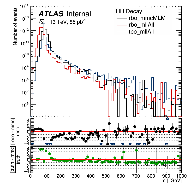
I named the pads as ax1 (main plot), ax2 (first pull plot), ax3 (second and last pull plot). As you can see, both the main plot ylabel and the second pull plot xlabel title are too close to the axis numbers. I tried the following command for the ax3 pad:
truratio_graph.GetYaxis().SetTitleOffset(2.0)
with truratio_graph being the graph plotted in ax3. And it had no effect on the plot .pdf or .png. But when I access the .root, and change the SetTitleOffset() from 1.4 (default) to any other number it works to an extent. I mean, the title moves away from the y-axis but it gets pushed out of the canvas, as you can see below:
I tried to increase the figure size, but it did not solve the problem. I tried to increase the Bottom margin of the Canvas with:
fig.canvas.SetBottomMargin(2.0)
But it didn’t work either. (can i do it in the .root file? I mean, change the canvas bottom margin in TBrowser?).
The same happens to the y label title in ax1, I changed the .SetTitleOffset() but it didn’t have any effect, but I can change it in the .root file, the main problem is that the x label title in ax3 gets out of the canvas, and I don’t know how to solve that, so I would appreciate any help or tips.
The code that I am using to make the plot is a bit extensive, but if needed I can make a minimal reproducible example.
Without your code it’s hard to guess what you have (and you mention y axis but use SetBottomMargin instead of SetLeftMargin), but probably you need to set the margins on the pads, not just the canvas. Check out this example: https://root.cern/doc/v610/canvas2_8C.html
But the yaxis label in both pull plots got too 'tight. Do you know how can I instead of 0,1,2… have the label numbered as 0,2,4 ?.
And just another thing. if you look at my .pdf output of the image, there is a black line below the last pull plot. This line is not plotted in the .png or .root outputs. Any idea of what may be happening?
I solved the issues about Ndivisions and TStyle. But the thing about the black line, I draw a lot of lines in my plot, could it be one of those lines?
I also tried something like:
ax3.frame.SetBorderSize(0.3)
to match the borders i inserted in ax3.pad so the x label title could appear in the plot, but it returns me this error:
AttributeError: 'TH1F' object has no attribute 'SetBorderSize'
It is not a major issue tho, if a go to TBrowser and opens it and them save as .pdf the black line disappears, so if it is too much trouble I’ll simply do that.
Sure, but now the code is a complete mess. So i will take some time do “clean” it up, i will have to do it later anyway, and I’ ll let you know when i do that.