Hi,
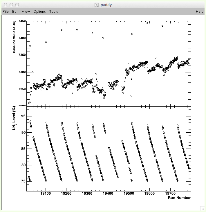
I am trying to make a good looking plot with two histograms that share the same x-axis. The problem is in the y-axis labels, they kind of overlap and I can’t make it look “nice”, if you know what I mean. I’ve attached my best result, but you can see that the y-axis doesn’t look right. How do I fix this? I’ve also attached my code (pyROOT).
#!/usr/bin/python
import sys, os, ROOT
"""
This is for plotting two histograms with differing y-ranges and the same x-range.
"""
# general style (taken from my rootlogon.C)
ROOT.gROOT.SetStyle("Plain")
ROOT.gStyle.SetPadTickX(1)
ROOT.gStyle.SetPadTickY(1)
ROOT.gStyle.SetPadTopMargin(0.05)
ROOT.gStyle.SetPadRightMargin(0.05)
ROOT.gStyle.SetPadBottomMargin(0.16)
ROOT.gStyle.SetPadLeftMargin(0.12)
ROOT.gStyle.SetPadBorderMode(0)
ROOT.gStyle.SetOptStat(0)
ROOT.gStyle.SetOptTitle(0)

# create two functions to draw
file = ROOT.TFile( sys.argv[1] )
tree = file.Get("fTree")
minRun = tree.GetMinimum("fRunNumber") - 10
maxRun = tree.GetMaximum("fRunNumber") + 10

# create a canvas and divide it
c1 = ROOT.TCanvas("paddy","paddy",700,700)
c1.Divide(1,2,0,0)

# Histogram for the reset rate in Hz
h1 = ROOT.TH2F("h1","h1",10000,minRun,maxRun,10000,7200,7450)
h1.SetMarkerStyle(24)
h1.SetMarkerSize(0.4)
h1.GetYaxis().SetTitle("Baseline Value (ADC)")

# Histogram for the Nitrogen Level
h2 = ROOT.TH2F("h2","h2",10000,minRun,maxRun,10000,72,98)
h2.SetMarkerStyle(24)
h2.SetMarkerSize(0.4)
h2.GetXaxis().SetTitle("Run Number")
h2.GetYaxis().SetTitle("LN_{2} Level (%)")

#top canvas
c1.cd(1)
ROOT.gPad.SetBottomMargin(0.001)
ROOT.gPad.SetTopMargin(0.01)
ROOT.gPad.SetRightMargin(0.01)
tree.Draw("baselineValueMean:fRunNumber>>h1","","goff")
h1.Draw()

# bottom canvas
c1.cd(2)
ROOT.gPad.SetTopMargin(0.001)
ROOT.gPad.SetRightMargin(0.01)
tree.Draw("fDetLnLevelAtBeginRun:fRunNumber>>h2","","goff")
h2.Draw()

# update the canvas
c1.Update()
raw_input('press enter')
Cheers,
Paddy