Dear experts,
I am trying to fit the dE/dx of four types of particles using an approximated Bethe-Bloch curve (defined in this paper Eq. (J.1) ).
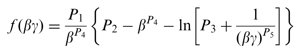
Therefore, I have one specific parameter for each dataset (the particle’s mass, embedded in beta in the expression above) and five common parameters.
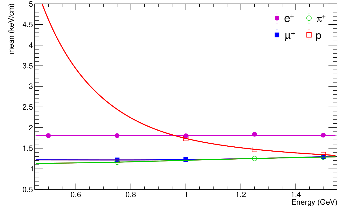
Fitting them independently is trivial; you can see the result in the attached plot.
However, I cannot find how to make a constrained fit that takes into account the fact that the datasets share 5 out of 6 parameters.
I found this tutorial, but it appears to me that this is not exactly the same situation.
Any hint or pieces of advice is welcome! Thank you.
Tristan