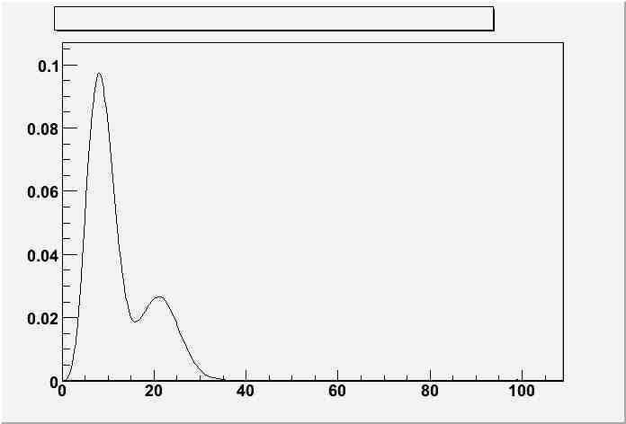
So here is the plot of a data using TGraph and TTree. I don’t understand what are those spikes on the curve?
I am afraid that we cannot do much without having a small data file and the command generating your plot> It could be just a binning effect.
Rene
Thanks for reply. Here is the data. The commands also are as following:
TTree t;
t.ReadFile(“DD_WS.txt”,“x/D:y/D”);
t.Draw(“x”,“y”,“C”);
TGraph tg(“DD_WS.txt”);
tg.Draw(“AC”);
DD_WS.txt (965 Bytes)
What you observe is a simple binning effect due to your x values.
You can solve the problem by forcing the range as follows
 TTree t;
 t.ReadFile("DD_WS.txt","x/D:y/D");
 t.Draw("x>>h(100,0,100)","y","C");
or
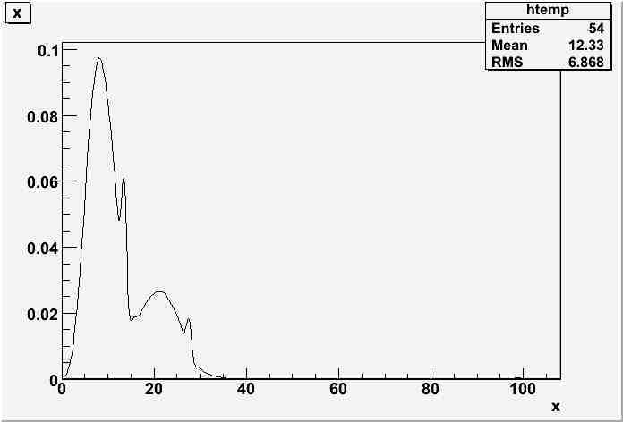
 TGraph g("DD_WS.txt");
 g.Draw("ac");
Rene
Thanks man.