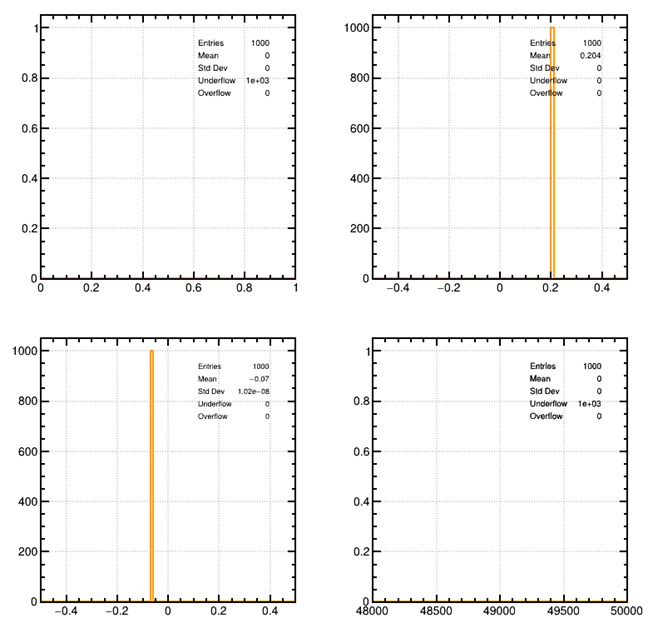
I have generated the SRIM table about the proton passing through the helium gas, When I imported the txt file to Garfield++,there is a plot like the below ,I don’t know how to understand it , and it really confused me.
The first three plots show histograms of the x, y, z coordinates of the tracks’ endpoints and the fourth plot shows a histogram of the number of electrons produced along a track.
You’ll probably need to adjust the axis ranges to your scenario.
Electronmagnetic and hadronic energy loss (these are calculated separately by SRIM, but only the electromagnetic one is relevant for Garfield).
Hi,
Thanks for your reply
I will try to change the parameters to make it work
Besides, would you please tell me how to merge or plot the different curves in the same plot? such as the srim of the proton in helium and the srim of the proton in nitrogen, then I can easily compare.
There isn’t an “out-of-the-box” function for that.
It’s not an ideal solution but you could save the plots/canvases as ROOT macros (.C files) and then edit/merge them.
It’s probably easier though if you just make the plot yourself from the SRIM output files using a plotting program you are familiar with…
Hi,
Thanks a lot for your reply
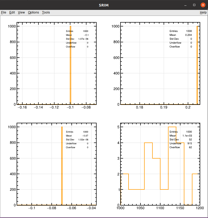
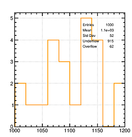
And your advice is helpful, I am confused theses days about the SRIM and TRIM which I haven’t used them before.So it’s a little bit hard for me to understand. I have read the histograms manual and learned a lot, but some problems still can’t be solved. the plot below shows the electrons track, what’s the X and Y coordinate represent for? I have changed the TH1F* hNe = new TH1F(“hNe”, “Electrons”, 10, 1000, 1200); value many times ,and I really don’t know why the number 1000~1200 is suitable, and dose the Y coordinate represent for the number of the electrons? And is the drift trajectory of the electron shown exactly in the figure?
No, the histograms in this example program are not “event displays” of the tracks. The first three histograms are intended as cross-checks that the spatial distribution of the tracks generated by TrackSrim is consistent with the range and straggling parameters from the SRIM output file. The fourth histogram (the one you were asking about) shows the distribution of the number of electrons produced along the track.
Hi,
Thanks a lot for your reply and detail explanation
So in the fourth plot , along the track there are only a few electronics generated, but what does the X coordinate means? the width or the detector’s thickness? the thickness of the detector only has 300 micron
So can I think that the SRIM or the TRIM simulation are not about the track in the detector, but the range I set as long as I wish. when I import the TXT files to the Garfield++, the Garfield++ will cut out the energy range and only save the field in the detector . Is that right?
Sorry, I don’t understand the question. Both SRIM and TRIM do simulate the energy loss of ions in matter. The SRIM output file contains average quantities and TrackSrim tries to generate tracks that are consistent with these average quantities, sampling the energy loss on a track-by-track basis from a Vavilov or Landau distribution. TrackTrim uses directly the ion trajectories contained in the TRIM EXYZ.txt output file.
To answer your previous question, in the fourth plot, the x-axis of the histogram is the number of electrons.
HI,
Thanks a lot for your reply.
In the fourth plot , what does the Y axis represent for (the biggest number is five)?
I realize the function of the SRIM and TRIM now, however if the TRIM can generate the track according to the average quantities calculated by SRIM, why does it need to be imported to the Garfield++, and then plotted. I think these two things are repeated.
It’s a histogram. The y-axis is the number of entries per bin.
Sorry, I’m still not sure I understand.
If you want to be able to use the tracks simulated by TRIM in Garfield++ then you need to import them by loading the EXYZ.txt file.
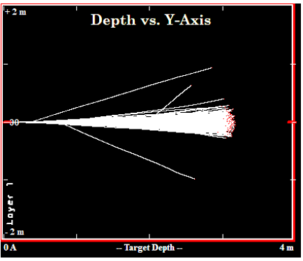
Hi,
Thanks a lot for your reply
I have got a plot like this from the TRIM, I think it is the proton track along the Y axis, so why does it need to be simulated through the Garfield++?
You are right, to simulate and visualize proton tracks you don’t need anything else than TRIM.
Garfield++ comes into play if you want to simulate the drift lines of the electrons/ions created along the track and the induced signal.