Hi All,
I put my code and the data. I noticed the Y values I read from a graph and from the fit are very different. Plus, fit is not so promising for low kinetic energy values on X axis. Y axis represents the electron range on Aluminium.
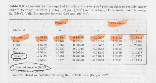
I couldn’t believe the parameters from article as well. Here, you can see the reference on the photo.
The data is retrieved from ESTAR: Stopping Power and Range Tables for Electrons
Thanks.
RangeFromFitting.cpp (2.0 KB)
AlElectronRange.txt (3.9 KB)
I’m not sure how to improve your fit. Maybe @moneta can take a look, or maybe you can try to use Roofit, and then @jonas could most probably help
I think, it is just what it is . Article and the book says it is pol2 if you believe. I have just noticed that the book says it is valid from energies between 0.01MeV to 100MeV on X axis. For pol6, I got better results now for the energy range between 40-100MeV.
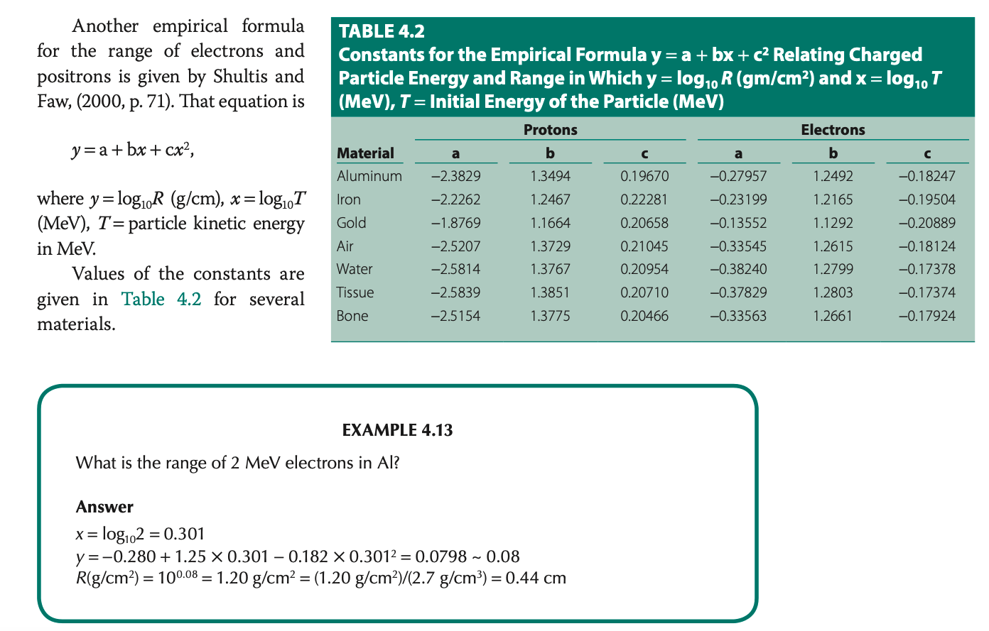
Here, the example on the book is . I guess both axis was chosen log scale at that time.