Dear Hageboeck,
thanks. This was the missing information, I thought that the weights were coming into play only when I had to apply the livetime corrections.
The fit now makes sense and I have other problems, but let me first answer to your question:
My text file has three columns, each row represent the results of a selection on a single dataset:
- start time of the dataset relative to the very first dataset.
- the number of the events passing selection (it can be interpreted as counts/hour since the typical duration of the dataset is 1h)
- effective duration of the dataset, representing the effective observation time once that DAQ busy or fraction of time with other problems are removed. But for the moment let’s ignore this part.
0.0 3402.0 3603.0
0.04179398148148148 3104.0 3603.0
0.08358796296296296 3122.0 3603.0
0.12538194444444445 3020.0 3604.0
...
26.07019675925926 0.0 3604.0
26.11199074074074 0.0 3604.0
26.153819444444448 1.0 3604.0
26.195613425925927 0.0 3602.0
Are these details enough to answer your question?
Next.
From my side, I am focusing only to the first 3 days where I can neglect the final flat background and use just a basic exponential model. The fit makes sense (at least the decay rate parameter is in the right ball park) but I have both a visualization and/or a practical problem, see the figure: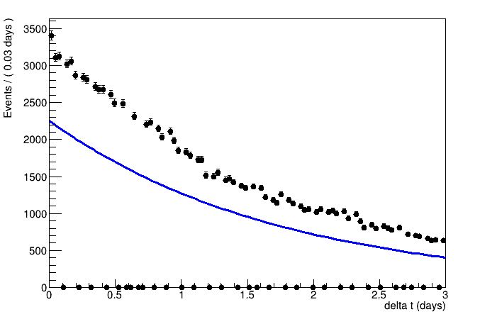
First of all, the fact that I am forced to choose a binning even if my data is unbinned makes the plot very ugly. The manual claims that the fit is anyway unbinned, but still I cannot show my points in this way.
I can reduce the number of bins to avoid such 0 bins, but then most bins have higher counts (which does not reflect my observation btw) and few have smaller counts due to various time gaps between each dataset.
I managed to make a custom binning from the differences of starting time of datasets, but in this way the bin contents shown are scaled with the bin width.
At the same time, the resulting fitted function does not use the correct normalization to overlap automatically with the data, but this seems dependent on the binning, e.g. with twice bin width it looks better overlapping.
The normalization that I get using RooExtendPdf is set to the sum of weights, i.e. the sum of countds, and I think that this normalization is used also for the non-Extended fit but this cannot be the right integral of the exponential function shape, because there are time gaps where the contributions to the sum of weight are skipped.
This is at least my best understanding from the manual chapters 2 to 4.
At the end this is not only a problem of visualization, whose a workaround would be to just use RooFit for the ML fit and standard tools for plotting, but if I do not understand what this tool is doing I cannot rely on the result.
Any hint on how to progress is really appreciated.
Matteo